
Luxury Beauty Blog
bunny
Honest makeup reviews, product comparisons, FOTD looks, and beauty hauls — from a beauty-obsessed friend who tells it like it is.
Explore the Blog
"I am a major beauty addict, but my biggest challenge is actually using the products I'm obsessing over! I shop frequently, but most days pass and not a speck of makeup goes on my face."
— Joyce, bronzer bunny
Meet Joyce
About bronzer bunny
A beauty journey, one swipe at a time
Joyce started bronzer bunny to share her honest take on luxury and mid-range beauty products. Based near Chicago, she's a self-described beauty addict who loves connecting with fellow enthusiasts. Her blog features in-depth reviews of brands like Chantecaille, Burberry, Tom Ford, Nars, Guerlain, and Tatcha — always with a warm, conversational voice.
Recurring series like Love It or Toss It, Products That Didn't Work for Me, Weekly Rotation, and Lipstick Diaries kept readers coming back for real talk about what's worth the splurge. From FOTD posts to shopping hauls along Chicago's Magnificent Mile, Joyce documented her makeup journey from November 2011 through early 2014.

Find Your Perfect Red Lipstick By Skin Undertone
A red lipstick can look polished, effortless, dramatic, or strangely disconnected from the rest of your face. The difference is rarely about finding the “right” shade of red in isolation. It usually comes down to the relationship between the lipstick’s undertone, your complexion, your natural lip color, and the finish of the formula.
Undertone is the subtle hue beneath the surface of your skin. It is generally described as cool, warm, neutral, or olive. Skin depth matters too, but depth and undertone are separate: a very fair complexion can be warm, while deep skin can be cool. Learning both will make lipstick shopping much less random.
The best red is also the one you will genuinely wear. A luxurious blue-red may photograph beautifully but feel too formal for weekday errands, while a sheer tomato tint may become an everyday favorite. Real-world comfort, transfer, opacity, and longevity deserve as much attention as the color in the tube.
Read Your Undertone Before Shopping
Cool undertones tend to show pink, rosy, red, or bluish hints beneath the skin. Silver jewelry may appear especially flattering, and veins can look blue or purple in natural light. This does not mean every cool-toned person must wear a berry lipstick, but blue-based reds often harmonize beautifully with this coloring.
Warm undertones usually have golden, peach, yellow, or slightly olive hints. Gold jewelry may blend naturally with the complexion, and veins can appear greenish. Warm skin often comes alive with tomato red, poppy, coral red, brick, chili, and orange-leaning shades.
Neutral undertones sit between cool and warm, making a wide range of reds wearable. You may look equally comfortable in silver and gold jewelry, or notice that your veins are difficult to classify. Olive undertones can be more complicated because the skin may look green, gray, golden, or muted. A red that is technically warm can still look surprisingly balanced against olive skin when it has enough depth and a slightly brown or neutral base.
Check your face and neck in indirect daylight rather than relying on an indoor mirror. Foundation, self-tanner, redness, and artificial lighting can disguise your undertone. Looking at the jawline, neck, and chest together gives a more useful impression than examining a flushed cheek.
Match Red Families To Your Coloring
Blue-based reds have a crisp, classic quality. They tend to make the teeth look brighter and can complement rosy or cool complexions without emphasizing surface redness. Think cherry, cranberry, ruby, wine-red, and true red. On very deep skin, a saturated blue-red can look especially vivid; on fair skin, the same family can create a high-contrast vintage effect.
Orange-based reds are energetic and flattering on warm skin. Poppy, vermilion, persimmon, and tomato shades bring out golden or peach undertones. If a blue-red makes your complexion look pale or slightly gray, an orange-red may restore warmth. However, highly orange formulas can highlight yellow tones in the teeth, so check the shade in daylight before committing.
Neutral reds are often the easiest starting point for anyone unsure of their undertone. They resemble the color of a ripe red fruit without leaning strongly toward blue, orange, pink, or brown. A classic neutral red can also be useful when your undertone changes visually with seasonal tanning, skincare, or a different foundation.
Brick, terracotta, and brown-red shades are excellent for muted or olive complexions. They have enough warmth to avoid looking stark but enough depth to remain sophisticated. Deep wine, oxblood, and garnet reds can work across undertones when they are sufficiently pigmented, although a very cool wine shade may look purple on some complexions rather than genuinely red.
Consider Depth, Contrast, And Lip Pigment
Your skin’s depth affects how a red reads, even when the undertone is correct. On fair skin, a deep red creates strong contrast and can become the focal point of the face. A sheer strawberry red or soft rose-red offers a gentler alternative. Medium skin can carry nearly every red family, while saturated reds tend to prevent the color from disappearing.
On tan and deep skin, pale reds may appear chalky or turn pink because the base is not deep enough. Look for formulas described as rich, intense, jewel-toned, or highly pigmented. Brick, scarlet, garnet, ruby, and deep cherry shades often maintain their character better than pastel or milky reds.
Natural lip pigmentation also changes the final result. A pale pink lip may allow a lipstick to appear close to the color in the bullet. Brown, purple, or uneven natural pigment can deepen the same product or shift it warmer. This is why online swatches are useful for narrowing choices but cannot replace testing on your own lips.
If you love a shade that looks slightly off, try a coordinating lip liner underneath. A brown-red liner can add depth and soften a bright tomato lipstick, while a berry liner can cool down a warm red. Avoid using liner only to overdraw; its main purpose here is to control the base color and improve the edge.
| Undertone or complexion clue | Red families to try | Finish that often works well | What to watch for |
|---|---|---|---|
| Cool, rosy, or pink | Blue-red, cherry, ruby, cranberry | Satin, cream, classic matte | Very orange reds may look separate from the skin |
| Warm, golden, or peach | Tomato, poppy, coral-red, chili | Cream, satin, glossy stain | Orange tones can emphasize yellow in teeth |
| Neutral | True red, balanced cherry, soft brick | Any finish, depending on comfort | Strongly blue or orange shades may dominate |
| Olive or muted | Brick, terracotta, brown-red, garnet | Satin, blurred matte, sheer balm | Bright reds can look neon or overly stark |
| Deep complexion | Scarlet, wine, oxblood, deep cherry | High-pigment satin or matte | Pale reds may look ashy or lose definition |
| Fair complexion | Rose-red, true red, berry, sheer strawberry | Sheer, satin, or precise matte | Very dark reds create significant contrast |
Choose A Formula That Supports The Shade
Color theory can identify a promising red, but formula determines whether you will enjoy wearing it. Matte lipstick usually delivers the strongest color payoff and cleanest outline. It can also emphasize dry patches, settle into lip lines, and feel tight after several hours. Exfoliating aggressively before application is rarely the answer; a comfortable balm applied ahead of time is usually more helpful.
Satin and cream formulas are forgiving and tend to make red feel less intimidating. They reflect enough light to keep the lips looking full while offering more pigment than a sheer balm. The tradeoff is movement: creamy reds may transfer onto cups, napkins, and the edges of teeth unless blotted.
Glossy reds and tinted oils create a softer, fresher effect. They are particularly useful when you want color without the visual precision of a traditional statement lip. Their wear time is usually shorter, and the pigment may fade unevenly after eating. A stain can leave a flattering veil behind, but some stains feel drying or cling to the center of the lips.
Wear claims should be judged against the conditions in which you actually use makeup. A long-wearing liquid lipstick may survive a dinner but feel uncomfortable during a dry office day. Likewise, a moisturizing bullet may be perfect in winter but slide in summer. My experience comparing base products has made this clear: the humidity foundation test is a good reminder that performance depends on environment, not just price or marketing language.
Test Red Lipstick In Real Light
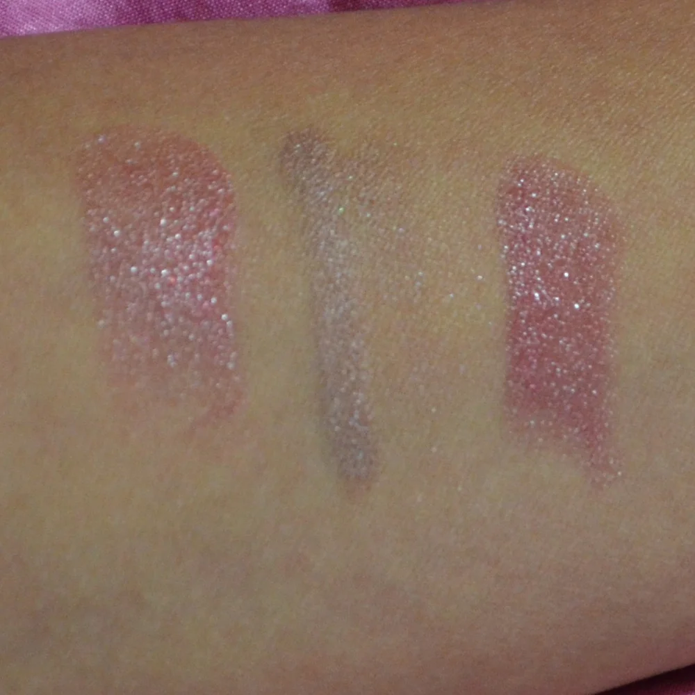
Swatch a lipstick on your lips whenever possible, not only on your arm. Arm skin often has a different undertone and much less natural pigmentation. Apply enough product to see its true intensity, then wait several minutes. Some formulas deepen as they set, while others become more muted once the emollients settle.
Look at the shade near a window, outside in open shade, and under the lighting where you expect to wear it. A red that seems neutral in a store may reveal a strong orange or blue cast outdoors. Check how it interacts with your teeth, blush, bronzer, and the skin around your mouth. A shade can be technically flattering but still clash with the makeup combinations you use most often.
A clean test should include the edges of the lips and the center, where natural pigmentation is often strongest. If possible, wear the color for a few hours. Notice whether the formula fades evenly, leaves a ring around the lips, migrates into fine lines, or becomes patchy after a snack.
For online shopping, compare multiple swatches from people with similar depth and undertone. Search for descriptions such as “blue-based,” “warm tomato,” “neutral scarlet,” or “brown-red,” but treat those labels as starting points rather than guarantees. Brand shade names are creative and inconsistent; “classic red” can mean almost anything.
Build A Wearable Red Lip Collection
You do not need a drawer full of nearly identical red lipsticks. A small collection with different moods is more practical. Start with a balanced true red in a comfortable satin or cream formula. It can be dressed up with a precise outline or softened by tapping it on with a fingertip.
Next, consider a red that relates specifically to your undertone. That might be a blue-red for cool skin, a tomato red for warm skin, or a brick-red for olive coloring. This is often the shade that looks most naturally integrated with your complexion rather than simply sitting on top of it.
A sheer or balm-like red fills a different role. It is easier to apply without a mirror, forgiving when it fades, and useful for casual makeup. If you prefer a polished statement, add a deeper red in a long-wearing satin or matte formula. The result is a useful range without unnecessary duplication.
For travel, choose products that can serve multiple purposes and survive different settings. A red lip liner can sharpen a creamy lipstick, reshape the look of a sheer one, or wear alone as a stain. A compact collection is easier to manage than packing every possible finish; these principles also appear in this guide to a capsule makeup bag.
A Practical Shopping Checklist
Use these steps before buying a full-size red, especially when the product is expensive or difficult to return:
- Identify whether your skin looks cool, warm, neutral, or olive in natural daylight, then note your complexion depth separately.
- Compare at least two red families, such as a blue-red and a tomato red, instead of testing only shades that already look appealing in the tube.
- Test the lipstick on your lips and allow it to settle before judging the undertone, opacity, and comfort.
- Select the finish according to your routine: satin for flexibility, matte for definition, stain for low-maintenance color, or gloss for softness.
- Wear the shade through a drink, meal, and several hours of conversation to assess fading, transfer, dryness, and whether the color remains attractive.
Make The Final Choice Personal
Undertone theory is a useful filter, but it should not become a strict rulebook. Makeup is allowed to create contrast. A cool-toned person may love a fiery orange-red because it makes the complexion look brighter, while someone warm may prefer a blue-red for a dramatic evening look.
Pay attention to the colors you already enjoy wearing. If your wardrobe is mostly camel, olive, cream, and rust, a brick or tomato red may feel effortless. If you reach for black, gray, navy, and jewel tones, cherry, ruby, or wine may feel more cohesive. Blush and bronzer matter too: a warm red can connect with peach blush, while a berry-red may pair better with rose or mauve.
Price should enter the decision only after the shade and formula earn their place. A luxury lipstick may offer a beautiful case, elegant texture, or unusually comfortable wear, but a less expensive red that suits your coloring and lasts through your day can be the smarter purchase. Honest wear testing and thoughtful comparisons are central to the beauty reviews and personal recommendations at Bronzer Bunny.
Try one balanced red, one undertone-specific shade, and one comfortable everyday formula. Photograph each in daylight, wear them through ordinary routines, and keep the shade that makes you feel most like yourself. The perfect red is less about following a universal rule than finding a color whose undertone, depth, texture, and staying power fit your real life.
Brands featured on bronzer bunny
Luxury & Mid-Range Favorites
Joyce covered an extensive range of beauty brands, from prestige houses to accessible drugstore staples.

Recurring Series
Love It or Toss It • Products That Didn't Work for Me • Weekly Rotation • Saturday Recap • Lipstick Diaries • Makeup Challenge!
JOYCE'S SIGNATURE SERIES KEPT READERS HOOKED
Read the Series