Luxury Beauty Blog
bronzer
bunny
Honest makeup reviews, product comparisons, FOTD looks, and beauty hauls — from a beauty-obsessed friend who tells it like it is.
Explore the Blog
"I am a major beauty addict, but my biggest challenge is actually using the products I'm obsessing over! I shop frequently, but most days pass and not a speck of makeup goes on my face."
— Joyce, bronzer bunny
Meet Joyce
About bronzer bunny
A beauty journey, one swipe at a time
Joyce started bronzer bunny to share her honest take on luxury and mid-range beauty products. Based near Chicago, she's a self-described beauty addict who loves connecting with fellow enthusiasts. Her blog features in-depth reviews of brands like Chantecaille, Burberry, Tom Ford, Nars, Guerlain, and Tatcha — always with a warm, conversational voice. Struggling to decide between cream and powder highlighters for your oily skin? Cream Versus Powder Highlighter for Oily Skin dives into the real-world wear time, texture, and shine control to help you make the right choice.
Recurring series like Love It or Toss It, Products That Didn't Work for Me, Weekly Rotation, and Lipstick Diaries kept readers coming back for real talk about what's worth the splurge. From FOTD posts to shopping hauls along Chicago's Magnificent Mile, Joyce documented her makeup journey from November 2011 through early 2014.

The Blog
Reviews, comparisons & real-life makeup
Dive into detailed eyeshadow comparisons like Is Chantecaille Sel a Dupe for Burberry Pale Barley?, explore bath treats from Lush, or weigh in on whether Tom Ford Ombre Eye Color in She Wolf is worth the splurge. The blog covers everything from high-end foundations to drugstore gems, with FOTD posts that show how products perform in real life. Curious how L’Oréal Infallible Fresh Wear holds up when the air gets thick and sticky? I took it out on a genuinely humid day to see if the formula earns its keep — and the honest results might surprise you. A Real-World Test of L’Oréal Infallible Fresh Wear on a Humid Day
Read the Blog Browse Archives
The bronzer bunny blog has long been a destination for readers who crave honest, real-world beauty commentary rather than polished marketing speak. The site's philosophy centers on showing how products actually perform after weeks of daily wear, not just how they look in a first swatch. This means readers can expect thoughtful discussions about staying power, texture shifts across seasons, and whether a product truly earns its place in a curated collection. The tone remains conversational and approachable, as though a knowledgeable friend is walking you through her makeup bag and sharing what she genuinely loves, what disappointed her, and what she keeps reaching for month after month.
One recurring theme across the blog is the idea of the product edit — a deliberately curated selection of items that earn repeated use rather than a sprawling, overwhelming stash. The author regularly shares which creams, lip products, and complexion picks are currently in her rotation, especially as the weather turns cooler and drier. These seasonal edits are particularly useful for readers who want to adapt their routines without buying everything new. The focus is on making thoughtful choices, revisiting old favorites, and understanding how a single product can shift from being an occasional indulgence to a daily essential.
The blog's coverage of lip products stands out for its depth and practicality. From matte crayons to creamy balms, the reviews dig into the details that matter most: how a formula feels after hours of wear, whether it dries out the lips, how it survives a meal, and how it compares to similar shades already sitting in most makeup bags. The author's willingness to test products over weeks and report back on the less glamorous realities — patchiness, feathering, or that awkward dry patch mid-day — gives readers the kind of intel they simply cannot get from a standard product page.
For those interested in skincare and body care, the blog offers a gentle but honest lens on products designed for dry, cool-weather skin. Creams, balms, and hand treatments from natural and botanical brands are explored with an eye toward real results rather than pretty packaging. The author openly discusses the process of finding the right texture, the convenience of multi-purpose formulas, and the satisfaction of finally landing on a product that works after weeks of testing. These pieces read like personal notes shared with a close circle, making the experience of discovering a new favorite feel collaborative and warm.
Eyeshadow comparisons are another cornerstone of the site, with detailed explorations of whether a high-end shade truly justifies its price tag or whether a more accessible option delivers the same effect. These comparison posts go beyond surface-level color matching, considering undertones, blendability, fallout, and how the shadows behave across different primers and tools. The goal is never to shame a purchase but to give readers the confidence to make informed decisions. Whether debating a luxe palette or celebrating a drugstore find, the writing maintains a balanced, curious tone that respects both budget-conscious readers and those willing to splurge.
The blog also embraces the fun, communal side of beauty through challenges and discussions that invite reader participation. From monthly focus themes to shared product experiments, these features create a sense of community around the simple joy of testing makeup. The author regularly encourages readers to share their own experiences, fostering conversations that extend beyond the comment section into social spaces. This interactive energy keeps the blog feeling alive and evolving, reflecting the same curiosity and willingness to experiment that draws people to beauty in the first place.
A notable chapter in the blog's history involved a sale of pre-owned beauty products from the author's personal collection. This was more than a simple transaction — it was an extension of the blog's commitment to transparency and decluttering. Readers had the chance to purchase items that had been reviewed and loved, giving beloved products a second life while freeing up space for new discoveries. The initiative resonated with readers who appreciated the opportunity to try products they had read about extensively, and it reinforced the blog's ethos of mindful consumption over mindless accumulation.
The visual and editorial identity of the site mirrors its content: earthy, warm, and grounded. With terracotta accents, muted rose and blue-grey panels, and sandy neutral backdrops, the design feels like a natural extension of the beauty philosophy being written about. The typography is bold and condensed, giving the pages a rugged, editorial quality that distinguishes the blog from the softer, more feminine aesthetic common across the beauty space. This distinctive visual language supports the writing's no-nonsense approach and makes the site instantly recognizable to returning readers.
As the blog continues to grow and evolve, the core mission remains unchanged: to share genuine opinions, useful comparisons, and personal notes from a real beauty routine. New posts continue to explore everything from high-end luxury items to clever drugstore picks, always with the same spirit of curiosity and honesty. Whether a reader is new to the site or has followed along for years, the content invites them to slow down, enjoy the process of discovery, and build a collection that truly reflects their needs and preferences. That thoughtful, personal approach is what keeps the bronzer bunny community coming back season after season.
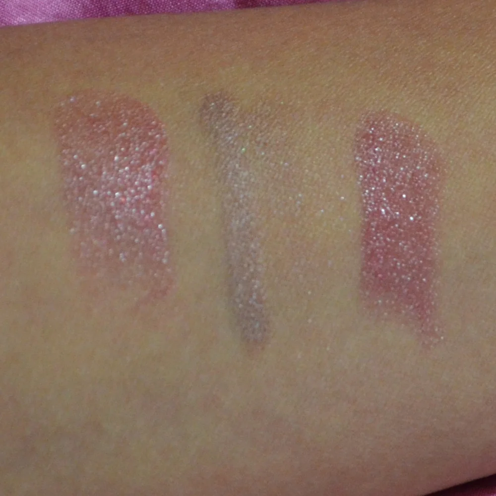
Honest swatches & comparisons
Joyce also ran a blog sale for pre-owned beauty products from her personal collection — a way for readers to shop items she'd reviewed or decluttered.
Blog SaleBrands featured on bronzer bunny
Luxury & Mid-Range Favorites
Joyce covered an extensive range of beauty brands, from prestige houses to accessible drugstore staples.
Recurring Series
Love It or Toss It • Products That Didn't Work for Me • Weekly Rotation • Saturday Recap • Lipstick Diaries • Makeup Challenge!
JOYCE'S SIGNATURE SERIES KEPT READERS HOOKED
Read the Series