
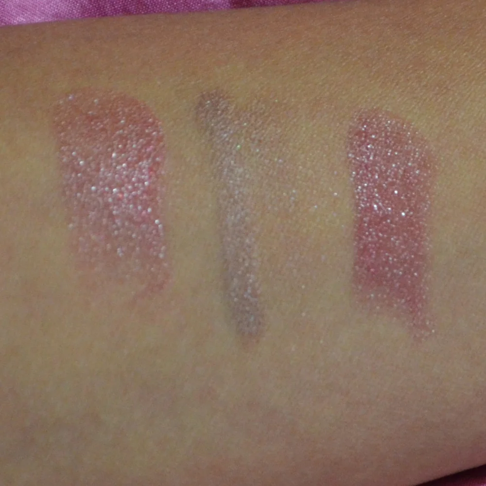
Luxury Beauty Blog
bunny
Honest makeup reviews, product comparisons, FOTD looks, and beauty hauls — from a beauty-obsessed friend who tells it like it is.
Explore the Blog
"I am a major beauty addict, but my biggest challenge is actually using the products I'm obsessing over! I shop frequently, but most days pass and not a speck of makeup goes on my face."
— Joyce, bronzer bunny
Meet Joyce
About bronzer bunny
A beauty journey, one swipe at a time
Joyce started bronzer bunny to share her honest take on luxury and mid-range beauty products. Based near Chicago, she's a self-described beauty addict who loves connecting with fellow enthusiasts. Her blog features in-depth reviews of brands like Chantecaille, Burberry, Tom Ford, Nars, Guerlain, and Tatcha — always with a warm, conversational voice.
Recurring series like Love It or Toss It, Products That Didn't Work for Me, Weekly Rotation, and Lipstick Diaries kept readers coming back for real talk about what's worth the splurge. From FOTD posts to shopping hauls along Chicago's Magnificent Mile, Joyce documented her makeup journey from November 2011 through early 2014.

Why I Stopped Buying Pat McGrath Palettes
For years, Pat McGrath eyeshadow palettes represented the most exciting kind of makeup purchase to me. The ornate packaging, jewel-toned color stories, and promise of editorial-level pigment made every launch feel like an event. I loved opening the cardboard box, lifting the magnetic palette, and swatching shades that looked almost unreal in the pan.
Eventually, the thrill became less connected to how often I actually used the products. I had several Mothership palettes with overlapping bronzes, pinks, plums, and golds, yet I kept reaching for the same dependable combinations. The artistry was still beautiful, but the price became harder to justify when a large portion of each palette stayed untouched.
This is why I stopped buying Pat McGrath palettes altogether, at least for the foreseeable future. It was not because the formula suddenly became poor or because luxury makeup has no place in my collection. I simply became more honest about wearability, repetition, texture, and the difference between admiring a product and reaching for it.
The Fantasy Was Better Than My Routine
Pat McGrath palettes are designed to create a sense of abundance. A large Mothership palette may include mattes, metallics, duochromes, glittering special shades, and dramatic finishes that photograph beautifully. That variety is part of the appeal, but it can also make the palette feel more versatile than it is for everyday makeup.
My actual routine is much narrower. I often wear a soft matte crease shade, a satin taupe or bronze on the lid, and a deeper brown along the lash line. For a dressier look, I might add a rose-gold shimmer or a smoky plum. Those combinations are flattering and practical, but they do not require ten or eighteen shades.
The special shades were especially persuasive when I first bought them. They caught the light in a way that ordinary shimmer could not, and I enjoyed experimenting with them for evening looks. In real life, though, some needed a glitter glue or a damp brush, and a few produced fallout that made them less convenient than I expected.
I also noticed that the most unusual colors were the least likely to leave my makeup drawer. A vivid chartreuse, bright fuchsia, or high-shine red can be inspiring without becoming a regular part of my face-of-the-day rotation. Beauty fantasy has value, but I no longer want to pay luxury prices mainly for colors I admire in photographs.
When Performance Stopped Matching The Price
The strongest argument for an expensive palette should be consistent performance across every finish. Pat McGrath does some things exceptionally well, particularly rich mattes and luminous metallics. Yet my experience across multiple palettes was not perfectly uniform. Some shades blended effortlessly, while others felt drier, sheerer, or more textured than their appearance suggested.
That inconsistency mattered because the retail price created high expectations. When I buy an inexpensive palette, I can accept that one shade may be disappointing. With a luxury palette, I expect the entire assortment to be thoughtfully balanced and reliable. A few exceptional shadows do not fully compensate for several shades I rarely use.
There is also the question of longevity. On my somewhat oily eyelids, the mattes generally held up with primer, but certain shimmers lost intensity after several hours. The more reflective formulas could crease or migrate if I applied too much. They were not unwearable, but they were not automatically effortless either.
Packaging played a role in my changing priorities. The heavy cases looked stunning on a vanity, but they took up significant space and were not especially convenient for travel. I began to value slim, edited palettes with shades I could use repeatedly instead of collecting impressive objects that mostly stayed at home.
How I Judge A Luxury Palette Now
My standards have become more practical without becoming less enthusiastic. I still want beautiful textures and distinctive shades, but I evaluate them through the lens of my actual habits. A palette needs to earn its place through frequency of use, dependable application, and enough variation to create several complete looks.
Price per shade is not a perfect measurement because it treats every color as equally valuable. For me, the better calculation is cost per frequently used shade. A palette with six excellent, wearable colors may provide more value than a larger palette containing three favorites and a collection of dramatic extras.
I also pay close attention to texture. I want mattes that build gradually instead of becoming patchy, metallics that apply well with a dry brush, and shimmers that do not require a complicated routine. A formula can be bold and luxurious while still being easy to control.
Color story matters just as much. I am less interested in a palette that repeats shades I already own, even if the arrangement is gorgeous. Neutral rose, warm bronze, and soft plum are flattering staples, but I do not need every version of them. A smaller palette should either offer a genuinely useful edit or provide a special shade range that feels meaningfully different.
For another perspective on whether prestige eyeshadow truly earns its cost, I revisited this Tom Ford quad breakdown. Comparing luxury products side by side made it easier to separate beautiful branding from the performance details that affect everyday use.
The Options That Make More Sense
The biggest change was moving toward smaller palettes and curated singles. Instead of buying a large color story for two or three shades, I can choose a compact quad or five-pan palette that reflects how I actually get ready. This approach has made my collection feel calmer and more personal.
Mid-range brands have become particularly appealing because they often offer the balance I wanted from luxury makeup: refined textures, attractive packaging, and realistic pricing. I am more willing to experiment with an unusual color when the financial commitment is smaller, and I feel less pressure to make every shade work.
Drugstore eyeshadow has improved as well. It does not replace every prestige formula, especially when I want a sophisticated metallic or exceptionally smooth matte, but there are affordable palettes with impressive blendability and flattering everyday tones. I have found that primer, brush choice, and application technique can narrow the gap considerably.
Single eyeshadows have also reduced waste for me. A cream-to-powder bronze, a neutral matte brown, or a softly reflective champagne can become a frequent favorite without bringing along eight shades I do not need. The collection grows more slowly, but each addition has a clearer purpose.
Comparing My Current Eye Makeup Choices
The table below reflects how I think about value now. It is based on practical use, not the prestige of the label or the excitement of a launch. A luxury palette may still win in packaging or special effects, but those qualities no longer outweigh limited wearability for me.
| Option | Best For | Strengths | Limitations | Value For My Routine |
|---|---|---|---|---|
| Large luxury palette | Collectors and creative looks | Exceptional presentation, broad shade range, distinctive finishes | High price, repeated colors, unused shades | Occasional treat rather than a staple |
| Small luxury quad | Polished everyday makeup | Cohesive selection, elegant textures, easy travel | Less variety and a higher cost per shade | Good when every shade is useful |
| Mid-range five-pan palette | Regular work and weekend looks | Wearable color stories, solid formulas, moderate price | Fewer unusual finishes | Excellent balance |
| Drugstore palette | Experimenting and casual makeup | Accessible price, improving formulas, easy replacement | Quality can vary between shades | Strong for basics |
| Single eyeshadows | Customized collections | No filler shades, flexible color selection, low waste | Requires more planning and storage | Best for intentional buying |
My most-used replacements tend to fall in the middle two categories. A compact palette with a cream-colored matte, medium transition shade, deep liner brown, soft bronze, and one brighter accent can handle far more of my life than a massive palette built around spectacle.
That does not mean I will never enjoy a luxury release again. It means the product must show me a clear reason to exist in my collection. A distinct texture, unusually thoughtful color story, or genuinely superior wear time could still tempt me, but familiar shades in elaborate packaging are no longer enough.
What I Reach For Instead
For everyday makeup, I now rely on neutral and softly warm palettes from mid-range lines. I look for balanced undertones because overly orange browns can make my eyes look tired, while very cool taupes can appear flat depending on the rest of my makeup. A mix of neutral brown, muted rose, bronze, and deep cocoa gives me enough flexibility without overwhelming choice.
Cream eyeshadows have become another favorite replacement. They are quick to apply with a fingertip, create a polished wash of color, and work well for busy mornings. I especially like formulas that set without becoming stiff, since they can be blended at the edges before they dry and layered for evening intensity.
For special occasions, I prefer adding one standout single shadow rather than purchasing an entire dramatic palette. A reflective copper, antique gold, or plum duochrome can transform a simple matte look. This gives me the creative effect I once sought from a Mothership palette while keeping the rest of the routine familiar.
I have also become more selective about online swatches. Studio lighting, filters, and carefully styled close-ups can make a palette appear more complex or dimensional than it is. Watching application in real time helps me judge fallout, opacity, blending, and how a shade looks on a moving face. My beauty video archive includes these kinds of real-world impressions, which I keep organized in the beauty video library.
My Rules For Buying Eyeshadow Now
A slower approach has made makeup shopping more enjoyable. I no longer feel that I need to purchase a palette immediately because it is limited edition or surrounded by dramatic launch imagery. I save the product, look at reviews from people with similar skin and eye concerns, and consider what it adds to my current collection.
These are the questions I use before buying:
- Can I create at least three complete looks with the shades?
- Do the colors offer something I do not already own?
- Will I use the formula without extra tools, glitter adhesive, or complicated steps?
- Is the expected wear time appropriate for the price?
- Would I still want the palette if the packaging were plain?
The last question is surprisingly effective. Luxury presentation can create an emotional reaction before I have evaluated the makeup itself. When I imagine the same colors in a simple black case, I can better identify whether I want the product or the fantasy surrounding it.
I also consider how a new palette fits with skincare and the rest of my makeup routine. If I am wearing a radiant base, a softly defined eye may look more harmonious than an intensely glittering one. If my schedule includes a long day, a reliable matte and satin combination is often more useful than a fragile high-shine finish.
A More Intentional Makeup Collection
Stopping my Pat McGrath palette purchases was less about rejecting luxury beauty and more about changing my definition of value. I still appreciate craftsmanship, beautiful formulas, and the artistry behind a thoughtfully designed collection. I simply want those qualities to show up in the way I use the product, not only in the unboxing experience.
My makeup drawer now contains fewer large palettes, more small edits, and a handful of single shadows that genuinely excite me. I have saved money, reduced duplication, and made my morning routine faster. Most importantly, I feel more connected to the products I own because they reflect my preferences instead of a launch calendar.
If a future palette offers exceptional wear, a truly original color story, and shades I can imagine using repeatedly, I will consider it on its own merits. Until then, my money is going toward formulas that perform consistently and products that become part of my real routine.
Explore the reviews, comparisons, and wear-test stories on Bronzer Bunny for more practical luxury, mid-range, and drugstore beauty recommendations—and use these buying principles the next time an elaborate eyeshadow launch catches your eye.
Brands featured on bronzer bunny
Luxury & Mid-Range Favorites
Joyce covered an extensive range of beauty brands, from prestige houses to accessible drugstore staples.
Recurring Series
Love It or Toss It • Products That Didn't Work for Me • Weekly Rotation • Saturday Recap • Lipstick Diaries • Makeup Challenge!
JOYCE'S SIGNATURE SERIES KEPT READERS HOOKED
Read the Series