
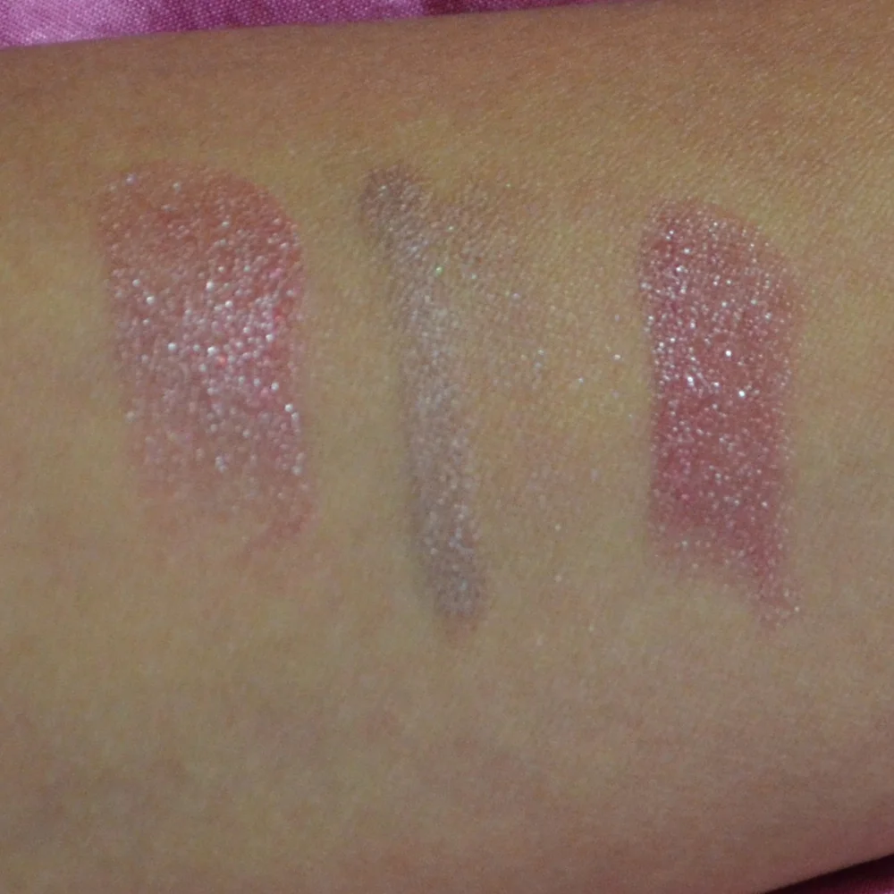
Luxury Beauty Blog
bunny
Honest makeup reviews, product comparisons, FOTD looks, and beauty hauls — from a beauty-obsessed friend who tells it like it is.
Explore the Blog
"I am a major beauty addict, but my biggest challenge is actually using the products I'm obsessing over! I shop frequently, but most days pass and not a speck of makeup goes on my face."
— Joyce, bronzer bunny
Meet Joyce
About bronzer bunny
A beauty journey, one swipe at a time
Joyce started bronzer bunny to share her honest take on luxury and mid-range beauty products. Based near Chicago, she's a self-described beauty addict who loves connecting with fellow enthusiasts. Her blog features in-depth reviews of brands like Chantecaille, Burberry, Tom Ford, Nars, Guerlain, and Tatcha — always with a warm, conversational voice.
Recurring series like Love It or Toss It, Products That Didn't Work for Me, Weekly Rotation, and Lipstick Diaries kept readers coming back for real talk about what's worth the splurge. From FOTD posts to shopping hauls along Chicago's Magnificent Mile, Joyce documented her makeup journey from November 2011 through early 2014.

Why a violet-toned setting powder cancels yellow tones
A good setting powder should make makeup look more polished without announcing that powder is what you are wearing. For me, the most useful formula is not always the palest translucent option or the one with the finest-looking packaging. Sometimes the real difference comes from its undertone, particularly when my complexion starts pulling too yellow after foundation, concealer and bronzer have all had their turn.
Violet powder has become my quiet corrective step. It does not transform my skin purple, and it is not intended to replace colour correction for every concern. Instead, its cool lavender cast helps soften excess yellow and warm golden tones, leaving the complexion looking more balanced, fresh and true to the shade I chose at the beginning.
That distinction matters in everyday makeup. A base can look perfect beside a window, then appear mustardy under office lighting, in a car mirror or after several hours of wear. Oils, skincare, sunscreen and the natural warmth of the skin can gradually shift the appearance of complexion products, especially when a foundation already leans golden.
Australian beauty shoppers will recognise the problem. A base that feels comfortable in a cool Melbourne morning may look much warmer during a humid afternoon in Brisbane or Sydney. Add strong daylight, SPF and the limited shade descriptions used by some local retailers, and a small amount of lavender-toned powder can be remarkably useful.
What violet powder actually does
Purple and yellow sit opposite each other on the traditional colour wheel, which is why violet makeup products can visually reduce excess yellow. The effect is subtle rather than theatrical. A finely milled lavender powder lays a faint cool veil over the skin, helping take the edge off a base that has become too golden, sallow or warm.
It is worth separating this from a bright purple concealer. Concealer is usually used more deliberately on a specific area, while setting powder is diffused across the places where shine and colour shift tend to appear. The powder also fixes creamy products in place, so it can improve both tone and texture at once.
The result is not necessarily “paler” skin. It is a more neutral-looking finish. On my complexion, the change is easiest to notice around the centre of the face, under the eyes and beside the nose, where concealer can otherwise turn noticeably yellow by lunchtime. The skin still looks like skin; it simply looks less overheated.
Why my base turns yellow during the day
Several things can make a foundation appear more yellow after application. A warm formula may oxidise as it meets air, oils and the rest of the skincare underneath. Some sunscreens leave a warm cast, while certain primers contain beige or golden pigments that quietly alter the final colour. Even a foundation that is technically a good match can look different once blush, bronzer and indoor lighting enter the picture.
Skin chemistry is another factor. I have noticed more warmth when I use richer moisturiser, and more colour movement around the nose and chin where makeup mixes with natural oil. In Australian summer, humidity can make this process especially obvious. A base that survives a dry winter day in Adelaide may need a different setting strategy for a sticky day near the coast.
This is why I prefer correcting only where necessary. Covering the entire face with a heavily tinted powder can flatten the complexion and make the undertone look strange. A light layer through the T-zone, beneath the eyes or over the high points is usually enough to take the golden cast down a notch while leaving cheeks and temples softly dimensional.
Choosing the right lavender formula
The shade of violet matters. A pale lilac powder is generally the easiest starting point for fair to light-medium skin, while a richer lavender or soft mauve may show up more naturally on medium and tan complexions. Very deep skin tones need a product with enough depth to avoid a grey or chalky film; a sheer violet veil is often more flattering than an opaque pastel.
I also look at the base colour of the powder in the pan and on a swatch. Some products marketed as lavender are really bright pink, while others are nearly white with a cool blue cast. Pink can freshen a dull complexion, but it will not have the same yellow-neutralising effect. Blue-heavy formulas can make warm skin look ashy if they are applied too generously.
Texture is just as important as colour. A finely milled powder with a soft, flexible finish is less likely to emphasise pores and dry patches. If the formula feels dense or heavily pigmented, I use a fluffy brush rather than a puff. Australian retailers such as Mecca and Adore Beauty often provide useful shade photographs, but an in-store swatch remains valuable because screen lighting can make lavender look much paler than it is.
How I apply it without looking purple
I start with a small amount on a tapered face brush, then tap most of it off on the back of my hand. The powder goes first where I see unwanted warmth: beneath the eyes, around the sides of the nose, across the centre of the forehead and sometimes on the upper lip. I press and roll rather than sweeping aggressively, which keeps the foundation underneath intact.
For a more polished under-eye, I use a small fluffy brush and apply the thinnest layer over concealer. This is where violet powder earns its place for me. It takes away that yellow-beige look without making the area look starkly bright, provided the concealer itself is not already too light. A damp sponge can also work, although I am careful not to load it with excess product; my comparison of three beauty sponges helped reinforce how differently tools can affect coverage.
After applying, I wait a minute and check the face in daylight. If the yellow tone is still visible, I add another whisper of powder instead of one heavy layer. This gradual method is especially helpful when getting ready near a bright Australian window, because strong sunlight can tempt you to over-correct what is actually a very minor shift.
The difference between brightening and correcting
Many powders are described as brightening, but brightness and colour correction are separate effects. A white or pale beige powder can make the centre of the face appear lighter, yet it may leave the same warm undertone underneath. A violet powder aims to visually balance warmth, so the face can look clearer without becoming obviously lighter.
That makes it useful when a concealer match is close but not perfect. If my under-eye concealer is slightly too warm, lavender powder can make the overall result more neutral. It cannot fix a concealer that is dramatically orange, nor can it disguise deep pigmentation on its own. Corrector, concealer and setting powder each have different jobs.
I also avoid using it over areas where I want warmth to remain. Bronzer should still look sun-kissed, and a peach blush should keep its lively colour. Applying cool powder over the cheeks can mute those products and remove the contrast that makes the complexion look healthy. The goal is targeted balance, not turning the whole face into a cool-toned canvas.
When it works best for Australian conditions
A violet setting powder is particularly helpful when heat, humidity and long wear make makeup look warmer. In Sydney or Brisbane, a quick trip outdoors can bring oil through the T-zone and make a golden base appear deeper. In Perth, bright light can expose every undertone shift, while Melbourne’s changeable weather may mean the same routine behaves differently from morning to afternoon.
I find it most reliable over lightweight foundation and hydrating concealer, where a small amount of powder can control shine without making the complexion heavy. It is less successful over very dry skin if I apply it everywhere. On those days, I press powder only into the inner under-eye and around the nose, then leave the cheeks with a natural finish.
Long workdays and events also show its value. At a wedding, a warm complexion can become more noticeable in photographs, especially under indoor lighting that is already yellow. A sheer lavender layer can help the face stay closer to its original shade, although I still avoid excessive powder because flash can reveal texture long before it reveals undertone.
Mistakes that can make the effect look flat
The most common mistake is applying too much. Violet pigment is forgiving in a sheer layer, but a thick coat can make skin appear grey, lilac or strangely dull. This is particularly easy to do with a powder puff, which picks up more product than a brush. I prefer to build slowly and inspect the result from several angles before deciding it needs more.
Another problem is using the powder to compensate for the wrong foundation shade. If the base is significantly too warm, too dark or oxidises orange, lavender powder may create an uneven surface rather than a natural correction. Testing foundation after it has settled for fifteen minutes is still essential. Powder should refine a close match, not rescue a mismatched one.
Finally, I keep the rest of the colour story in mind. Cool lavender powder pairs beautifully with neutral blush, rose tones and soft mauve eyeshadow, but it can make a very orange bronzer look disconnected. My wider testing notes and product observations live on Bronzer Bunny, where I return to the practical question behind every beauty purchase: how does it perform outside a perfect studio setup?
How I decide whether it earns a place
I judge the powder after several hours rather than immediately after application. I look for a base that still resembles my chosen foundation shade, under-eyes that have not become muddy, and a finish that has controlled shine without turning dry. I also check whether the lavender effect disappears naturally as the powder settles or remains visible in photographs.
The best formulas feel almost invisible. They soften unwanted yellow without demanding a separate makeup look, and they do not interfere with blush, bronzer or highlighter. For me, that quiet versatility makes them more useful than an intensely brightening powder that only works under one type of lighting.
A violet-toned setting powder is therefore less of a beauty trick and more of a small colour-theory adjustment. Used sparingly, it can keep a warm foundation looking neutral, make concealer appear fresher and help makeup remain believable through heat, humidity and changing light. It is a particularly satisfying addition for anyone who likes their base polished but not obviously corrected.
If your complexion regularly turns golden by midday, try swatching a sheer lavender powder and wearing it on only half of the face. Compare it in natural light, bathroom lighting and a phone photograph after a few hours. That simple test will show whether this cool-toned finishing step gives your makeup the balance it has been missing.
Brands featured on bronzer bunny
Luxury & Mid-Range Favorites
Joyce covered an extensive range of beauty brands, from prestige houses to accessible drugstore staples.
Recurring Series
Love It or Toss It • Products That Didn't Work for Me • Weekly Rotation • Saturday Recap • Lipstick Diaries • Makeup Challenge!
JOYCE'S SIGNATURE SERIES KEPT READERS HOOKED
Read the Series