
Luxury Beauty Blog
bunny
Honest makeup reviews, product comparisons, FOTD looks, and beauty hauls — from a beauty-obsessed friend who tells it like it is.
Explore the Blog
"I am a major beauty addict, but my biggest challenge is actually using the products I'm obsessing over! I shop frequently, but most days pass and not a speck of makeup goes on my face."
— Joyce, bronzer bunny
Meet Joyce
About bronzer bunny
A beauty journey, one swipe at a time
Joyce started bronzer bunny to share her honest take on luxury and mid-range beauty products. Based near Chicago, she's a self-described beauty addict who loves connecting with fellow enthusiasts. Her blog features in-depth reviews of brands like Chantecaille, Burberry, Tom Ford, Nars, Guerlain, and Tatcha — always with a warm, conversational voice.
Recurring series like Love It or Toss It, Products That Didn't Work for Me, Weekly Rotation, and Lipstick Diaries kept readers coming back for real talk about what's worth the splurge. From FOTD posts to shopping hauls along Chicago's Magnificent Mile, Joyce documented her makeup journey from November 2011 through early 2014.

The best highlighter colors for cool- and warm-toned skin
Highlighter can brighten the complexion, sharpen the look of cheekbones, and make a simple makeup routine feel polished. Yet the shade that creates a soft, candlelit glow on one person can look gray, orange, or overly metallic on someone else. Skin undertone plays a major role, but surface tone, blush color, texture, and lighting matter too.
Cool-toned skin usually has pink, red, bluish, or rosy undertones, while warm-toned skin leans golden, yellow, peach, or olive. Neutral complexions can move between both families depending on the season and the products worn underneath. The best highlighter color should harmonize with that underlying tone rather than sit on top of it like a separate stripe.
There is also a difference between a shade that looks beautiful in a compact and one that wears well in real life. A finely milled pearl may be ideal for daytime, while a reflective gold or wet-look champagne might suit evening makeup. Considering finish, intensity, and application style helps you find a highlighter that enhances skin instead of emphasizing texture.
How undertone changes a highlighter’s effect
Cool undertones tend to look most seamless with reflective shades that contain pink, silver, mauve, or blue-based elements. These colors echo the natural flush in the skin and create a fresh, glassy effect. Very pale cool complexions often suit icy pearl and soft pink, while medium and deep cool skin can carry richer rose, berry, and lilac tones without looking washed out.
Warm undertones generally pair well with gold, peach, bronze, apricot, and warm champagne. These shades amplify golden radiance and make the skin appear sun-kissed. On fair warm skin, pale champagne or peach can look more natural than a strong yellow gold. Medium and deep warm complexions usually have enough depth for honeyed gold, copper, and bronze highlighters.
Neutral skin has the most flexibility, though that does not mean every shade performs equally well. Neutral champagne, beige pearl, soft rose gold, and balanced peach are reliable starting points. If your foundation appears pink in winter and golden in summer, keeping two highlighter families available can help your makeup stay harmonious throughout the year.
Flattering colors for cool-toned skin
Icy pearl is a classic choice for fair cool skin. Its white-silver reflection catches light without introducing obvious yellow, making it especially effective on the tops of the cheekbones, the bridge of the nose, and the inner corners of the eyes. Look for a translucent finish rather than a stark white pigment if you want the result to remain soft.
Pale pink highlighter gives cool complexions a lively, youthful glow. It works beautifully over rosy blush and can make the cheeks look naturally flushed rather than heavily powdered. For more ideas on coordinating blush and complexion products, this guide to pink blush shades is a useful companion when building a cool-toned cheek look.
Lavender and lilac are more distinctive options for fair to medium cool skin. A subtle lavender sheen can counteract sallowness and create an editorial effect, especially when paired with mauve blush or cool taupe eyeshadow. These shades need a light hand, since too much purple pigment can look bruised rather than luminous.
Rose highlighter is particularly attractive on medium and deep cool undertones. It brings warmth in a controlled, rosy direction without becoming orange. Deep skin can also wear plum, berry, and cool copper illuminators, provided the product has enough pigment and reflection to remain visible instead of turning ashy.
Radiant shades for warm-toned skin
Warm champagne is one of the most versatile options for golden and peachy undertones. It has enough yellow or beige to blend into the complexion while retaining a bright reflective quality. On fair warm skin, choose a champagne that is closer to ivory than bronze; overly deep formulas can look like contour rather than highlight.
Peach highlighter creates a healthy, softly sunlit finish. It is especially attractive when paired with coral, apricot, or warm pink blush. Because peach contains both warmth and a hint of rosy color, it can flatter complexions that sit between warm and neutral. A satin peach balm can look natural during the day, while a shimmery powder offers more visible impact.
Gold and honey shades suit medium, tan, and deep warm skin particularly well. They bring dimension to the high points of the face and work naturally with bronzer. On deeper skin, a rich yellow gold or antique gold usually looks more radiant than pale silver, which can leave a gray cast. Copper-gold is another striking choice for evening makeup.
Bronze highlighter is best treated as a glow product with depth rather than a traditional light-reflecting shade. It can be beautiful across tan and deep skin, especially along the temples, upper cheekbones, and shoulders. If you have fair skin, use bronze sparingly and choose a sheer formula so it does not create a muddy patch.
Highlighter shades at a glance
The finish often determines whether a color feels natural. A shade with fine pearl particles can flatter a wide range of undertones, while chunky glitter makes color differences more obvious. Cream and liquid formulas tend to melt into the skin, whereas powder highlighters provide greater intensity and are easier to layer over long-wearing makeup.
| Skin undertone or depth | Highlighter colors to try | Shades to approach carefully | Best companion products |
|---|---|---|---|
| Fair cool | Icy pearl, silver pearl, pale pink | Yellow gold, strong bronze | Rose, pink, or mauve blush |
| Fair warm | Ivory champagne, peach, soft gold | Blue-white silver, deep copper | Apricot, coral, or warm pink blush |
| Fair neutral | Neutral champagne, beige pearl, soft rose | Very blue lavender or intense yellow | Neutral pink and peach blush |
| Medium cool | Pink pearl, rose, lilac, cool champagne | Orange-gold, yellow bronze | Berry, mauve, and cool rose blush |
| Medium warm | Peach-gold, honey, warm champagne | Frosty silver, pale lavender | Coral, terracotta, and apricot blush |
| Medium neutral | Champagne, rose gold, balanced peach | Extremely icy or strongly orange shades | Pink-peach and neutral bronzer |
| Deep cool | Rose, berry, plum, cool copper | Chalky white pearl, pale silver | Wine, raspberry, and plum blush |
| Deep warm | Rich gold, bronze, copper, honey | Ashy pink, flat silver | Burnt orange, brick, and terracotta blush |
| Deep neutral | Bronze-champagne, rose gold, neutral gold | Very pale pastel tones | Balanced berry, peach, and brown blush |
Use the chart as a starting point rather than a strict rule. A cool-toned person can wear gold if it is sheer and balanced with warm blush, and a warm-toned person can wear pink if it has enough depth. The goal is visual harmony, not a limited makeup wardrobe.
Texture and finish matter as much as color
A highlighter’s color may be perfect while its texture works against your skin. Powder formulas are convenient and often long-lasting, but a dry, glitter-heavy formula can emphasize pores, fine lines, or flaky patches. Pressed powders with finely milled shimmer tend to look more refined than products containing large particles that sit visibly on the surface.
Cream and liquid highlighters are often better for normal, dry, or mature skin because they create a diffused sheen. They can be tapped over foundation with fingers or a damp sponge, though some formulas disturb base makeup if rubbed too firmly. Apply thin layers and allow each one to settle before adding more.
Oily skin can wear cream highlighter successfully, but placement and setting become important. Keep the glow on the upper cheekbone rather than the center of areas that naturally become shiny. A long-wearing liquid underneath a light veil of matching powder can improve durability without turning the finish flat.
For everyday makeup, satin and soft-focus finishes are usually the easiest to wear. Metallic formulas deliver stronger impact and photograph beautifully, but they require careful blending. If texture is a concern, test the product in daylight and at a normal conversational distance rather than judging it only under bright store lighting.
Placement creates a more natural glow
The upper cheekbone is the most universally flattering placement because it catches light as the face moves. Start near the outer cheek and blend slightly toward the temple, avoiding the area directly beneath the eye if that region has visible texture. The result should appear like light coming through the skin, not a separate band of shimmer.
A small amount on the brow bone can connect the eye look to the complexion, particularly with pearl, champagne, or soft gold shades. The inner corner benefits from a brighter and finer highlight, while the tip of the nose usually needs very little product. Excessive shine in the center of the face can make makeup look less polished in photographs.
The cupid’s bow is a good place for a tiny touch of highlighter when wearing lipstick, but the shade should coordinate with the lip color. A cool pink glow works with berry and mauve lipstick, while peach or gold suits coral, nude, and terracotta tones. For a body glow, extend the same color onto the collarbones and shoulders to keep the finish cohesive.
Layering blush over or around highlighter can make the cheek look dimensional. Apply cream blush first, add a light veil of highlighter, and then soften the edges with a clean brush. With powder products, place blush and highlighter next to each other rather than stacking thick layers in the same spot.
Choosing a shade that works in real life
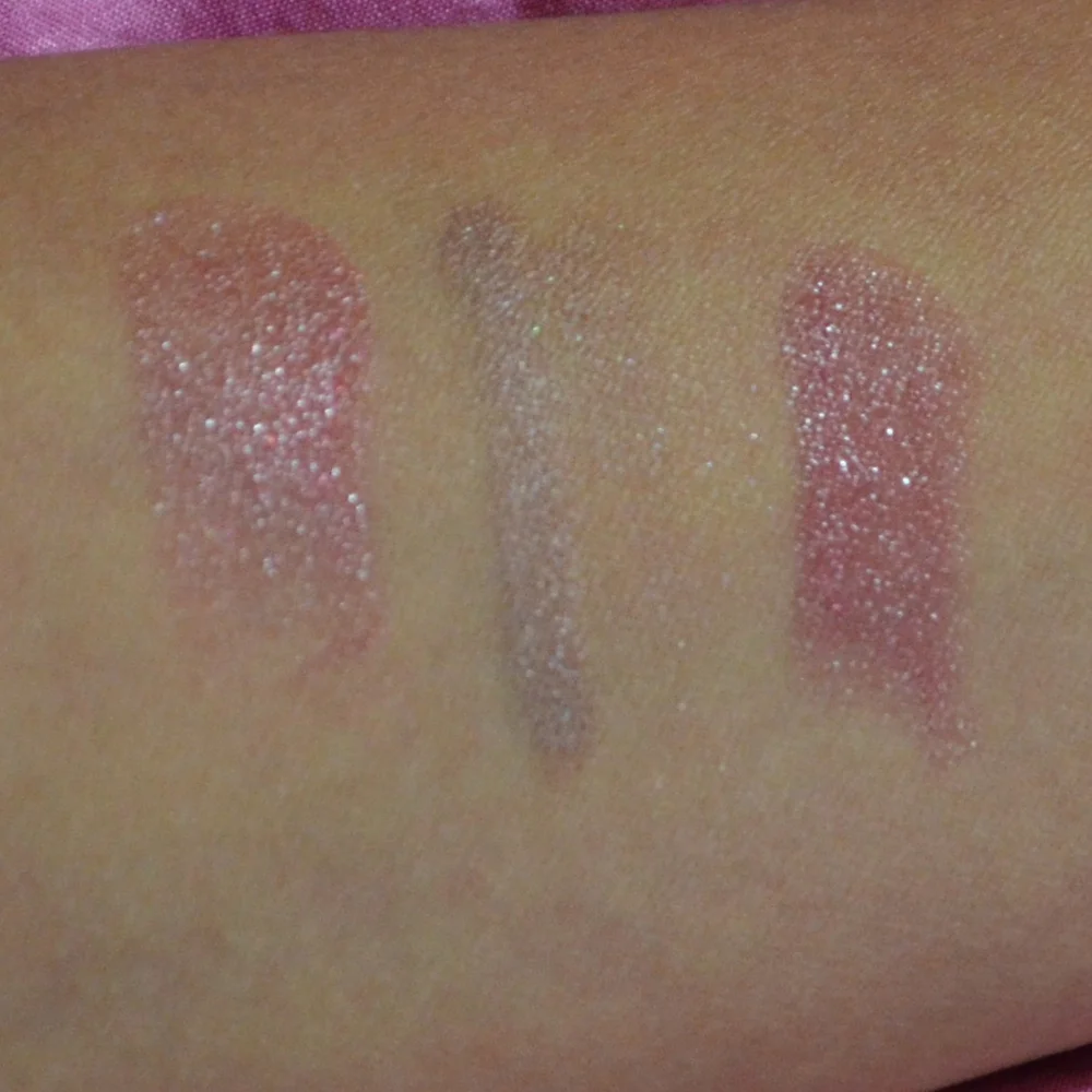
Swatching highlighter on the hand can be misleading because the skin there may have a different undertone and texture from the face. Test a small amount along the cheekbone or jawline whenever possible. Check it in natural window light, indoor light, and a phone camera, since some formulas show an obvious white or colored cast in photographs.
Consider the rest of your makeup before deciding a shade is wrong. A gold highlighter may appear too warm next to cool pink blush but look seamless with peach blush and bronzer. Likewise, an icy pearl can seem stark with orange-toned makeup yet beautifully complement mauve eyeshadow and a rosy cheek.
Keep your preferred intensity in mind. If you enjoy a barely-there sheen, look for words such as satin, luminous, soft pearl, or radiant. If you prefer a high-impact finish, terms like metallic, molten, chrome, and wet-look usually indicate a stronger reflection. Reviews that discuss wear time and texture are particularly helpful because color alone does not reveal how a product behaves after several hours.
Price is another practical consideration. Luxury highlighters may offer elegant packaging, refined texture, and unusual shade design, but an affordable product can perform just as well when the pigment, particle size, and undertone are right. Comparing products across price points—and checking the current beauty sale—can make it easier to find a finish that fits both your routine and your budget.
A simple way to build your highlighter wardrobe
You do not need a large collection to cover every occasion. One complexion-matching shade for daily wear, one brighter option for evening makeup, and one versatile blush topper can create plenty of variety. Choose formulas that differ in finish or depth rather than buying several nearly identical champagne powders.
- Start with a neutral champagne if your undertone is difficult to identify or changes seasonally.
- Choose pearl, pink, or lavender for a cool, fresh effect and gold, peach, or bronze for warmth.
- Match the highlighter’s depth to your skin so it reflects light instead of leaving a gray or orange patch.
- Prefer finely milled powder or thin cream formulas when visible texture is a concern.
- Test the shade with your usual blush, bronzer, and foundation before judging its final appearance.
When in doubt, look at the overall color story of your makeup. A highlighter is most flattering when it seems connected to the blush, bronzer, eyeshadow, and lip rather than chosen in isolation. The right shade should disappear into the complexion while leaving behind a convincing reflection.
Build your next glow around one shade that suits your undertone, one finish that suits your skin texture, and one application method you can repeat easily. With thoughtful testing and a light hand, cool and warm complexions can both achieve a refined highlight that looks beautiful in daylight, photographs naturally, and lasts through the moments that matter.
Brands featured on bronzer bunny
Luxury & Mid-Range Favorites
Joyce covered an extensive range of beauty brands, from prestige houses to accessible drugstore staples.

Recurring Series
Love It or Toss It • Products That Didn't Work for Me • Weekly Rotation • Saturday Recap • Lipstick Diaries • Makeup Challenge!
JOYCE'S SIGNATURE SERIES KEPT READERS HOOKED
Read the Series