
Luxury Beauty Blog
bunny
Honest makeup reviews, product comparisons, FOTD looks, and beauty hauls — from a beauty-obsessed friend who tells it like it is.
Explore the Blog
"I am a major beauty addict, but my biggest challenge is actually using the products I'm obsessing over! I shop frequently, but most days pass and not a speck of makeup goes on my face."
— Joyce, bronzer bunny
Meet Joyce
About bronzer bunny
A beauty journey, one swipe at a time
Joyce started bronzer bunny to share her honest take on luxury and mid-range beauty products. Based near Chicago, she's a self-described beauty addict who loves connecting with fellow enthusiasts. Her blog features in-depth reviews of brands like Chantecaille, Burberry, Tom Ford, Nars, Guerlain, and Tatcha — always with a warm, conversational voice.
Recurring series like Love It or Toss It, Products That Didn't Work for Me, Weekly Rotation, and Lipstick Diaries kept readers coming back for real talk about what's worth the splurge. From FOTD posts to shopping hauls along Chicago's Magnificent Mile, Joyce documented her makeup journey from November 2011 through early 2014.

The Best Blush Colors for Olive Skin That Never Look Ashy
Olive skin can be wonderfully versatile, yet blush shopping often brings a specific frustration: shades that look fresh in the pan turn gray, chalky, or strangely muted once they meet a yellow-green undertone. The issue is rarely that olive complexions cannot wear blush. It is usually a mismatch between the color’s base, its intensity, and the way it interacts with your natural undertone.
The best blush colors for olive skin tones that don’t look ashy tend to have warmth, clarity, or enough depth to stay visible against the complexion. Apricot, terracotta, cinnamon rose, warm berry, and balanced coral are especially dependable starting points. A soft plum can also be beautiful when it has red or brown warmth rather than a cool blue cast.
Your skin depth matters, too. A pale olive complexion may need a sheer peach or muted coral, while medium and deep olive skin can support richer brick, berry, and burnt orange shades. Finish makes a difference as well: satin and cream formulas usually give olive skin a lively dimension, while very pale matte powders can emphasize dullness.
Why Some Blush Shades Turn Gray
Ashiness usually appears when a blush contains too much white, blue, lavender, or cool gray pigment for your undertone. A dusty mauve may look sophisticated in a compact, but on olive skin it can lose its rosy quality and read as a flat shadow. Pale pastel pinks can have the same effect, particularly when layered over a matte foundation or powder.
Olive undertones are often a mixture of yellow, green, and neutral characteristics. That greenish cast can soften or alter colors placed on top of it. A cool pink may become mauve, a beige nude may look slightly green, and a purple-leaning berry can appear bruised instead of flushed. This is why a shade that looks universally flattering in a campaign image may behave differently in everyday lighting.
Look for blushes with a clear red, orange, coral, or warm brown foundation. That does not mean every olive complexion needs bright orange cheeks. It means the formula needs enough warmth and pigment to maintain its character after blending. If you prefer a cool effect, choose a red berry or rose with depth instead of a pale lavender pink.
The Most Reliable Color Families
Peach is one of the easiest shades for light to medium olive skin because its yellow-orange base works with the complexion rather than fighting it. Soft peach gives a healthy, rested look, while apricot adds more warmth and tends to remain visible through foundation. For deeper olive skin, choose a saturated peach, papaya, or orange-coral color instead of a milky pastel.
Terracotta and cinnamon are excellent choices when you want a sculpted, sun-warmed cheek. These shades sit between blush and bronzer, creating definition without the grayness that some contour-toned blushes can produce. A sheer terracotta cream can look especially natural across medium and tan olive complexions, while a brick-rose powder offers more polish for evening makeup.
Warm rose is a useful everyday category for anyone who finds peach too sunny. Search for rose shades with brown, cinnamon, or red undertones rather than a blue-pink base. On fair olive skin, a muted warm rose can look quietly elegant. On deeper skin, a richer rosewood or raspberry rose gives enough contrast to avoid disappearing.
Berry shades are surprisingly flattering when chosen carefully. Cranberry, warm raspberry, and red-plum blushes can mimic a natural flush and add life to an olive complexion. Avoid berries that look predominantly blue or violet in the pan. A tiny amount of warmth helps these deeper colors appear fresh rather than bruised.
Matching Blush to Your Depth and Finish
Color depth is as important as undertone. Very light blushes can turn chalky on medium or deep olive skin, while a deep pigment applied too heavily can look disconnected from a fair complexion. Sheer formulas give you room to build, so they are often safer when you are testing an unfamiliar color family.
Cream and liquid blushes tend to flatter olive skin because they preserve a translucent quality. They melt into foundation and leave behind a skinlike veil, which can keep warm color from looking stark. A satin powder can provide a similar effect if it has finely milled pigment and a little reflective dimension. Extremely flat matte formulas need more careful placement and blending.
Glowy blush can be beautiful, but shimmer particles should be fine rather than glittery. Golden-peach or bronze-rose radiance usually harmonizes with olive undertones. White or icy pearl can create a pale cast over the cheeks, especially when it is concentrated on textured skin. If your base makeup is already luminous, a satin blush often gives a more balanced result than a high-shine formula.
| Blush Color | Best Olive Skin Match | Finish to Consider | Effect on the Cheeks |
|---|---|---|---|
| Soft peach | Fair to light olive | Cream or satin | Fresh and awake |
| Apricot coral | Light to medium olive | Sheer liquid or soft matte | Warm, healthy flush |
| Terracotta | Medium to deep olive | Cream or satin powder | Sun-warmed definition |
| Cinnamon rose | Light to deep olive | Satin or balm | Natural and polished |
| Warm raspberry | Medium to deep olive | Buildable cream or powder | Lively, sophisticated color |
| Brick red | Tan to deep olive | Sheer matte or satin | Dramatic but wearable |
| Red plum | Medium to deep olive | Cream or blurred powder | Rich, softly flushed effect |
Shades Worth Testing in Store
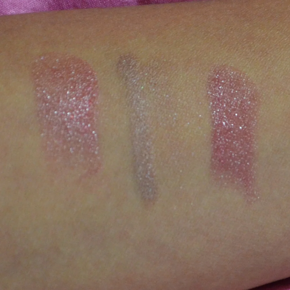
When swatching, place blush along the upper cheek rather than the back of your hand. The cheek area gives you more useful information about how the color works with your complexion, foundation, and natural redness. Blend the edges instead of judging a concentrated stripe, since a shade can look intense in one spot and beautifully sheer once diffused.
Test the color in both indoor and natural light. A warm store display can make a blush appear more golden, while cool daylight may reveal an unwanted gray or purple cast. Give the product a few minutes as well. Cream and liquid blushes can settle, deepen, or lose their initial shine as they dry down.
If you are comparing two similar shades, choose the one that looks slightly warmer and clearer on bare skin. Once applied over sunscreen or foundation, it may become more balanced. A blush that already looks dull in a swatch is unlikely to become brighter after layering. Pigment should be adjustable, but the underlying tone should feel lively from the beginning.
Packaging can be misleading, particularly with baked powders and duochrome formulas. A blush may appear brown or orange in the pan and diffuse into a flattering neutral warmth. Conversely, a pretty pale pink can leave a stark, powdery veil. The final result depends on the brush, pressure, base products, and the amount of skin showing through.
Making Blush Work With the Rest of Your Makeup
Bronzer and blush should support each other rather than compete for warmth. If your bronzer is golden or caramel, a peach, coral, or cinnamon blush will create a seamless transition. If you prefer a neutral bronzer, warm rose and berry blushes can add the color that keeps the face from looking flat.
Placement also changes the effect of a shade. Applying blush high on the cheekbones creates lift and makes a vivid color feel modern. Sweeping it slightly toward the center of the face creates a softer, more youthful flush. For terracotta or brick tones, keep the strongest concentration toward the outer cheek and blend inward so the color resembles sun or natural warmth.
Your brows, eyes, and lips can influence how warm a blush appears. A bronze eye look may make a neutral rose blush seem cooler, while a terracotta lip can make the same cheek color look more orange. This is useful when building a cohesive face-of-the-day look. For ideas on balancing color across the face, my brow product ranking offers a helpful reminder that small changes in surrounding features can alter the whole makeup effect.
Skincare and base preparation matter as well. Dry patches can catch powder pigment and make any blush look uneven or dusty. A comfortable moisturizer, a smooth sunscreen layer, and a light application of foundation create a better surface for color. When my skin needs extra softness, I am more likely to reach for a cream cleanser switch and a less powder-heavy makeup routine.
Application Adjustments for a Natural Flush
Start with less product than you think you need, particularly with red, berry, and brick shades. Tap a small amount onto the back of your hand or a palette, then press it onto the cheek with fingers, a dense synthetic brush, or a damp sponge. Building in thin layers gives you control over intensity and prevents the warm pigment from sitting on top of the skin.
For powder blush, use a soft brush and remove excess before touching your face. Pressing the brush onto the cheek can deposit too much color in one area, which is harder to correct on a textured or powdered base. A light sweeping motion followed by gentle pressing helps the blush merge with foundation instead of looking painted on.
If a favorite blush looks slightly ashy, try changing the base beneath it. A thin layer of warm bronzer or a golden-tinted complexion product can make a cool blush appear more harmonious. You can also mix a cool rose with a peach or terracotta shade. This is often more successful than discarding the product, particularly when you like its finish.
A blush that looks too orange can be softened with a neutral rose, while an overly purple shade can be balanced with a touch of coral. Mixing on a palette gives the most predictable result, but layering sheer colors directly on the cheek can work too. Keep the first shade light so the second has room to blend.
A Practical Shopping Shortlist
When choosing a new olive-friendly blush, prioritize the color family before the brand name or finish claims. A luxury formula may offer beautiful texture and lasting power, but a reasonably priced blush with the right undertone can be just as flattering. Since real-world wear varies with climate, skincare, and base makeup, consider how the product performs across a full day rather than relying solely on a swatch.
These guidelines make a useful starting shortlist:
- Choose peach or apricot for a bright, easy daytime flush.
- Pick terracotta, cinnamon, or brick when you want warmth and subtle definition.
- Try warm rose when you prefer a natural-looking everyday color.
- Select cranberry, raspberry, or red plum for richer contrast on medium to deep olive skin.
- Favor cream, liquid, or satin textures when matte blushes tend to look dull.
Longevity deserves attention, especially if your complexion becomes oily through the day. A cream blush may look most skinlike at first, while a finely milled powder layered lightly over it can extend wear. For dry skin, applying powder sparingly keeps the cheeks from losing their natural dimension. For combination skin, place long-wearing color only where you need it instead of covering the entire cheek with multiple layers.
The right shade should still look like part of your face after several hours. Check whether it fades evenly, gathers around pores, or shifts warmer as it wears. These details are often more revealing than the first ten minutes after application. A blush that starts subtle and remains smooth may be more useful than an intensely pigmented formula that requires constant correction.
Finding Your Most Flattering Olive Blush
There is no single olive complexion, so the ideal blush may be peach, rose, berry, terracotta, or a combination of several shades. Start by identifying whether your skin is fair, light, medium, tan, or deep, then look for colors with enough warmth or saturation to remain clear against your undertone. If you are uncertain, compare a warm rose, an apricot, and a cinnamon shade side by side.
Keep an eye on how the color behaves with your existing makeup. A blush should connect your bronzer, eyeshadow, and lip color without making the face look overly coordinated. Texture is equally personal: a sheer balm may be perfect for an effortless weekday routine, while a satin powder can provide the precision and staying power needed for a special occasion.
Testing thoughtfully will help you avoid the ashy shades that make olive skin look muted. For product questions, personal recommendations, or details about a specific complexion match, you can get in touch with Bronzer Bunny. Then take your favorite warm, clear blush into natural light, build it gradually, and let your own skin decide whether the color truly belongs in your routine.
Brands featured on bronzer bunny
Luxury & Mid-Range Favorites
Joyce covered an extensive range of beauty brands, from prestige houses to accessible drugstore staples.
Recurring Series
Love It or Toss It • Products That Didn't Work for Me • Weekly Rotation • Saturday Recap • Lipstick Diaries • Makeup Challenge!
JOYCE'S SIGNATURE SERIES KEPT READERS HOOKED
Read the Series