
Luxury Beauty Blog
bunny
Honest makeup reviews, product comparisons, FOTD looks, and beauty hauls — from a beauty-obsessed friend who tells it like it is.
Explore the Blog
"I am a major beauty addict, but my biggest challenge is actually using the products I'm obsessing over! I shop frequently, but most days pass and not a speck of makeup goes on my face."
— Joyce, bronzer bunny
Meet Joyce
About bronzer bunny
A beauty journey, one swipe at a time
Joyce started bronzer bunny to share her honest take on luxury and mid-range beauty products. Based near Chicago, she's a self-described beauty addict who loves connecting with fellow enthusiasts. Her blog features in-depth reviews of brands like Chantecaille, Burberry, Tom Ford, Nars, Guerlain, and Tatcha — always with a warm, conversational voice.
Recurring series like Love It or Toss It, Products That Didn't Work for Me, Weekly Rotation, and Lipstick Diaries kept readers coming back for real talk about what's worth the splurge. From FOTD posts to shopping hauls along Chicago's Magnificent Mile, Joyce documented her makeup journey from November 2011 through early 2014.

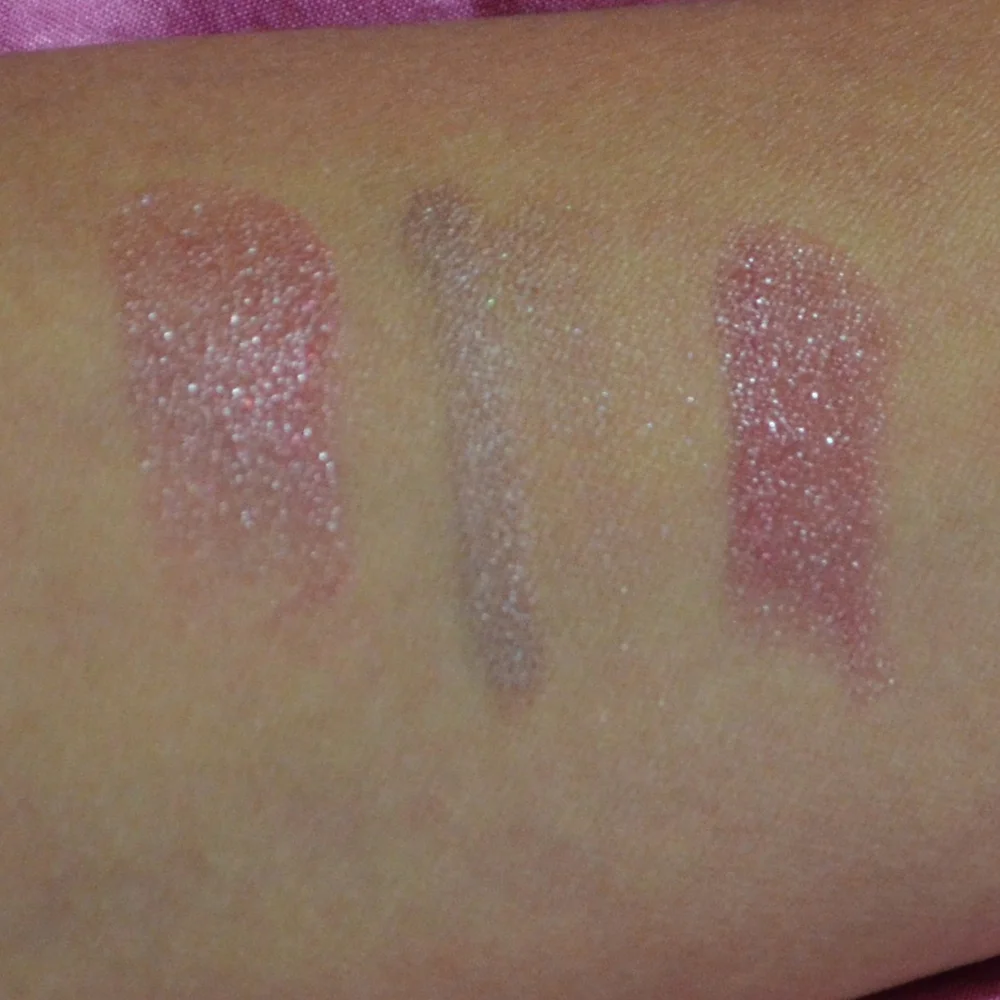
My lipsticks for every season and occasion
My wardrobe of lipsticks for every season and occasion is built around rotation, not endless shopping. A colour that feels wrong in June can become the obvious choice in July, and the soft peach I reach for on a humid morning has no business sharing a drawer with a deep winter red. I keep a small edit of shades and formulas, then add seasonal pieces only after testing them properly. I also weigh how often I will wear each shade, because a limited edition can still be a poor match for my daily routine.
Rather than treating a lipstick as a one-use purchase, I think of each one as a wardrobe workhorse. Some colour deserves a special occasion; others need to survive a working day, a flight and dinner without becoming a smudged memory. The best shade is the one I actually wear, even when the camera is off. That practical approach keeps my collection useful and my spending much more sensible. The shade I reach for on a tired morning often tells me more than the one that performs perfectly for an evening photograph.
Australian seasons add an interesting twist. Autumn colours arrive in April and May, while the berry shades I associate with crisp Chicago weather belong to Australia’s cooler months. In Melbourne, a jacket can appear beside a warm afternoon and a sudden downpour, so flexible shades earn their place. Summer air-conditioning can be just as drying as winter heating, making comfortable texture and a reliable moisturising base as important as colour.
I shop across price points, from luxury counters and beauty department stores to discount aisles and online-only deals. Australian prices are shown in dollars with GST included, and stock can differ between local retailers, so I compare the formula and shade before buying a supposed bargain. You will find those comparisons, wear tests and personal recommendations in my personal beauty reviews. That approach matters when a popular shade is sold out online or offered under a different name at another local counter.
Building a wearable colour capsule
A useful lipstick wardrobe starts with a few shades that sit between neutral and noticeable. I like one soft rose for everyday wear, one warm nude for a polished face, one berry for depth and one true red for when I want the mouth to carry the look. These are guidelines rather than rules: skin tone, undertone and the rest of the makeup matter more than a neat colour chart.
Getting the undertone right saves a lot of trial and error. Blue and pink undertones tend to suit berry, plum and true red, while golden or olive undertones often sing in terracotta, coral and warm brown. I also check how a shade behaves on the lower lip, where colour can look stronger than on the fuller upper lip. A lipstick that looked subtle in the tube becomes much more visible once it meets your actual skin. My NARS Dolce Vita handles the warm-nude part of that plan without turning beige, and I test in daylight too, since store lighting can make a cool shade look warmer than it really is.
Summer shades that outlast the heat
Aussie summer calls for shades with a little lightness but enough pigment to survive an active day. Peach, bright coral and warm rose work particularly well with bronzed skin and the sun-warmed finish I want after a beach walk. Charlotte Tilbury Pillow Talk fits this brief, offering enough pink to brighten my face without looking too dressed up. A sheer pink can work too, provided I choose one with good staying power and pair it with a nourishing balm rather than applying it over a dry base.
My summer formula brief is simple: comfortable, not sticky, and happy to be re-applied after lunch. A satin bullet gives me that balance, while a cream lipstick can look fresh at a casual gathering. For a humid Gold Coast outing, I keep the shade in my bag and expect to refresh it after coffee. The colour matters, but a lip product that feels unpleasant in hot weather will soon be left at home. A simple SPF lip balm underneath helps, provided I let it settle before applying colour.
Autumn warms with berry and brick
Autumn is where my collection earns its name. A muted berry adds softness to a full face of makeup, a brick red brings warmth without looking severe, and a cocoa nude makes an ordinary workday feel pulled together. These are colours I can wear beyond the season too, particularly the berry shade, which works with both a trench coat and a black dress. A Revlon Super Lustrous in Rhapsody in Burgundy gives that berry effect at a much friendlier price.
Texture becomes especially useful here. I tend to choose a blurring balm or satin formula for richer autumn shades, as a flat matte can make the lip look heavier when the weather turns dry. On a blustery Melbourne afternoon, I apply a hydrating balm, wait briefly, then add colour in thin layers. It gives a more even finish and makes the lipstick easier to reapply when I am out and about.
Winter reds that work beyond party season
A rich red does not need to be reserved for an evening event. The trick is choosing a shade with the right depth and pairing it with makeup that supports it rather than competes with it. A red with a blue undertone looks crisp and classic; a warmer red feels more dramatic against golden skin. I keep both because they create very different effects, even when worn with the same black coat. MAC Chili is my warm-red pick, while a blue-based red takes the classic route.
Wearing red at work starts with restraint: clean brows, softly defined eyes and a lip that is not fighting a heavy base. I can also make it seasonal by choosing a cranberry or wine shade for dinner. Since Christmas in Australia falls in summer, the deep red in my bag has to work for a December celebration as well as a June gathering. The most useful shade feels festive without looking out of place.
Spring pastels with a grown-up twist
Spring brings a change in mood and an excuse to revisit softer shades. I like a muted pink for the office, a peach that looks fresh with bare skin, and a dusty lilac for when I want something less predictable. The colours still need enough saturation to show on my lips; an overly pale pastel can disappear as soon as I sip a coffee or apply sunscreen.
The grown-up part comes from the pairing. A soft lip looks modern with neat brows, a light base and a satin highlight rather than a heavy contour. For a spring lunch, I often choose the peach shade and keep the rest of the face quiet. At a wedding or a long afternoon with friends, the dusty rose gives me a little colour while still looking effortless in the photographs.
Choosing a shade for work, weekends and events
Work calls for dependable colour, usually a rose, nude or softened red that can handle a video call without looking severe. I prefer a satin finish because it reflects a little light without taking over the face, and I choose a shade I can reapply without a mirror or a complicated cleanup routine. Neutral lipstick can still look polished when the application is neat and the edges are softened with a fingertip. It is also worth checking how a shade looks when the meeting light turns harsh rather than flattering.
Weekends allow more personality, and this is where I bring out a brighter coral or a berry that I would keep tucked away for a weekday. For events, I look at the dress, the season and how much talking I expect to do. A transfer-resistant liquid lip can be useful for a wedding or a long dinner, while a classic bullet has more of that freshly applied finish. For a face-of-the-day look, I pair the lip with this pore-friendly highlighter when I want glow without drawing attention to texture.
Testing wear, comfort and value
I judge a lipstick on three points: how it feels during the day, how it looks after several hours and whether the price feels fair for that performance. A beautiful colour that flakes or leaves the lips uncomfortably dry needs convincing to earn a place in the wardrobe. Equally, a flattering everyday shade can justify a modest price if it wears evenly and fits easily into a routine. Skincare habits matter too, because hydrated lips give almost every colour a smoother appearance.
Luxury formulas often bring a refined texture, elegant packaging and shades I cannot find elsewhere, but they are not automatically better. Mid-range products can deliver the colour and comfort I want, while drugstore options are often the practical workhorses of my collection. I compare the finish, ingredients and wear rather than assuming the logo sets the standard. Priceline, Chemist Warehouse, Sephora and David Jones offer different selections, so my ideal lipstick may cost less in one place than another.
Now it is time to make your own edit. Start with the colour you reach for most often, then consider the season, setting and time you need it to last. Try the shade on your lips, check it in daylight and wear it through a real day before committing. That simple habit turns a pretty tube into a product you know, trust and actually use. I keep a small note on my phone with the shades I have tested, which stops me from buying an almost identical tube.
When you are ready to refresh your bag, you can shop the sale and compare each option with your seasonal edit. Remember that Australian stock and pricing change, so read the details and check the shade before checkout. Choose the colour that fits your life now, then give it a proper trial before adding another tube to the wardrobe.
Brands featured on bronzer bunny
Luxury & Mid-Range Favorites
Joyce covered an extensive range of beauty brands, from prestige houses to accessible drugstore staples.

Recurring Series
Love It or Toss It • Products That Didn't Work for Me • Weekly Rotation • Saturday Recap • Lipstick Diaries • Makeup Challenge!
JOYCE'S SIGNATURE SERIES KEPT READERS HOOKED
Read the Series