
Luxury Beauty Blog
bunny
Honest makeup reviews, product comparisons, FOTD looks, and beauty hauls — from a beauty-obsessed friend who tells it like it is.
Explore the Blog
"I am a major beauty addict, but my biggest challenge is actually using the products I'm obsessing over! I shop frequently, but most days pass and not a speck of makeup goes on my face."
— Joyce, bronzer bunny
Meet Joyce
About bronzer bunny
A beauty journey, one swipe at a time
Joyce started bronzer bunny to share her honest take on luxury and mid-range beauty products. Based near Chicago, she's a self-described beauty addict who loves connecting with fellow enthusiasts. Her blog features in-depth reviews of brands like Chantecaille, Burberry, Tom Ford, Nars, Guerlain, and Tatcha — always with a warm, conversational voice.
Recurring series like Love It or Toss It, Products That Didn't Work for Me, Weekly Rotation, and Lipstick Diaries kept readers coming back for real talk about what's worth the splurge. From FOTD posts to shopping hauls along Chicago's Magnificent Mile, Joyce documented her makeup journey from November 2011 through early 2014.

I Tested the Y2K Chrome Shadow Trend With Affordable Singles
The Y2K beauty revival has moved well beyond frosty lip gloss and skinny brows. This season, the most wearable version of the era’s futuristic makeup is chrome eyeshadow: silvery, high-shine color that catches the light every time you blink. I wanted to see whether affordable singles could deliver that reflective, almost liquid-metal effect without requiring a luxury palette or professional application skills.
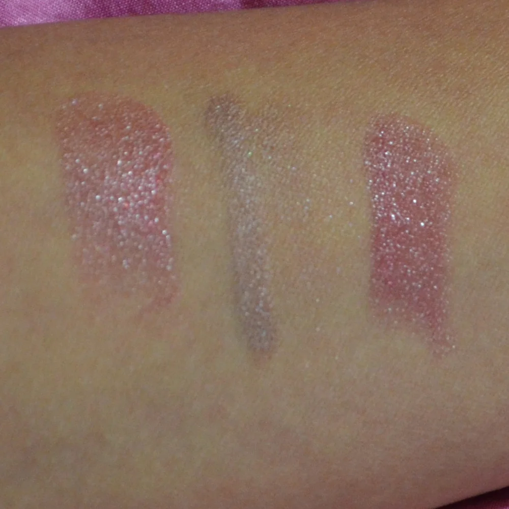
For this experiment, I chose inexpensive pressed and cream shadows in silver, icy lavender, blue-gray, pale champagne, and a soft pink duochrome. I tested them on bare skin, over primer, with fingertips and brushes, and in both daylight and indoor lighting. The goal was not simply to find the brightest shade, but to discover which formulas looked polished rather than flaky, dated, or difficult to wear.
This is very much the kind of real-world beauty test I enjoy sharing on Bronzer Bunny, where the question is always whether a product performs well enough to earn space in an everyday makeup bag. Chrome shadow can look spectacular in a product photo, but texture, fallout, creasing, and removal matter just as much once it leaves the swatch arm.
Why Chrome Makeup Feels So Y2K Again
The original Y2K aesthetic favored anything that looked futuristic, glossy, or slightly artificial. Silver eyeshadow fit perfectly with metallic handbags, vinyl clothing, rhinestone accessories, and the icy complexion trend of the time. The modern interpretation is a little softer. Instead of covering the entire lid in opaque silver, many current looks use reflective shadow at the center of the lid, along the inner corner, or as a glossy accent over a neutral base.
That placement made the trend much easier for me to wear. A full chrome lid can emphasize every crease and make the eye area look textured, especially if the formula contains obvious glitter particles. A concentrated strip of shine gives the same space-age effect while leaving room for matte taupe, brown, or mauve around the edges.
The finish also changes dramatically depending on the light. In direct daylight, a good chrome shadow should flash silver, pewter, or pastel color rather than look like scattered craft glitter. Under warm indoor bulbs, some shades became champagne or icy beige. That versatility is what kept the look feeling fresh instead of costume-like.
The Affordable Singles I Put Through Their Paces
I picked shades based on finish rather than brand loyalty. My group included a cool silver metallic, a pale lavender with a blue shift, a champagne chrome, a gunmetal shade, and a pink-lilac duochrome. I also included one cream formula because cream-to-powder shadows often create the wettest-looking reflection with the least effort.
The silver was the most immediately dramatic. It packed onto the lid with a fingertip and gave a bright foil effect in one layer. The downside was that it showed every bit of dryness on my eyelid and became slightly grainy when layered too heavily. The lavender duochrome was more forgiving. It looked soft from straight ahead, then shifted blue and pink when I turned my face.
The champagne shade was the easiest for daily makeup. It brightened the inner corner and looked beautiful over brown liner, but it was less obviously Y2K than the silver and lavender options. The gunmetal shade needed more patience because its darker base made patchiness visible. The cream shadow delivered the smoothest sheen initially, though it required careful application to prevent creasing.
For anyone building a small collection, I would start with one pale reflective shade and one colorful duochrome. Buying several near-identical silvers can be tempting, but the differences between a bright foil, a translucent sparkle, and a wet-looking metallic are more noticeable in use than they are in a pan.
Application Made The Biggest Difference
My favorite method was applying a thin layer of eye primer, allowing it to set for a few seconds, and then pressing the shadow onto the lid with a fingertip. I used a flat synthetic brush only for the inner corner and lower lash line. Swiping with a fluffy brush softened the shine too much and created unnecessary fallout.
For a more authentic early-2000s effect, I placed the lightest chrome shade from the inner corner through the center of the lid, then blended a muted gray-brown into the outer corner. A thin black or charcoal liner helped anchor the brightness. I kept the crease matte because adding shimmer everywhere made the look lose its shape.
The duochrome shades performed especially well over a deeper cream base. A brown or plum pencil smudged around the lash line gave the shifting pastel color more contrast. I would avoid putting a sticky gloss product directly on the eyelid unless it is specifically designed for eye use; the finish may look shiny, but the resulting creasing is rarely worth it.
I also learned to do the eyes before foundation. Even the best affordable metallics left a few particles beneath the eyes during application. A piece of tape can lift stubborn fallout, but using a clean tissue or small amount of cleansing balm is gentler than repeatedly rubbing delicate skin.
How The Formulas Compared
The table below reflects my experience after wearing each type for a full workday, roughly eight hours, with primer. Prices are approximate and vary by retailer, sales, and shade availability.
| Formula type | Finish | Application | Wear time | Best feature | Main drawback |
|---|---|---|---|---|---|
| Pressed metallic silver | Foiled and bright | Best with fingertip | 6–7 hours | Instant Y2K impact | Can emphasize texture |
| Lavender duochrome | Shifting pastel chrome | Easy to build | 7–8 hours | Color changes in different light | Needs a smooth base |
| Champagne metallic | Soft reflective sheen | Brush or fingertip | 7–8 hours | Most wearable for daytime | Less dramatic than silver |
| Gunmetal shimmer | Smoky metallic | Requires careful blending | 6 hours | Adds depth to a chrome look | Can become patchy |
| Cream-to-powder shadow | Wet-looking shine | Fingertip application | 5–6 hours | Smoothest initial finish | More likely to crease |
| Loose metallic pigment | Maximum sparkle | Needs primer or mixing medium | 6–7 hours | Strongest reflective effect | Highest fallout risk |
The affordable singles held up better than I expected. The pressed metallics faded gradually rather than disappearing, and the duochrome retained its shift until late afternoon. None looked exactly as intense at hour eight as they did when freshly applied, but that was fine. The softer finish was easier to wear and still visible in the mirror.
The cream formula was beautiful for the first few hours, particularly on a day when my eyelids were not oily. By the end of the afternoon, it had gathered in the crease and lost some of its smoothness. Setting the cream with a tiny amount of matching powder improved the longevity, though it also reduced the glossy effect slightly.
Loose pigment won for maximum drama but lost for convenience. It created the most reflective, almost liquid-metal finish, yet the application involved more preparation and cleanup. For a party or photograph, it would be worth the extra step. For a quick weekday look, the pressed singles were much more practical.
The Shades That Earned A Place In My Routine
My favorite overall shade was the lavender duochrome because it gave the trend personality without demanding a completely silver makeup look. It paired well with cool brown, mauve, gray, and even warm bronzer. When tapped over a matte lavender base, it became bold enough for evening; worn alone at the inner corner, it looked delicate.
The champagne chrome was my most-used option. I wore it over a soft brown shadow for brunch, then intensified it with a second layer for dinner. It made my eyes look more awake and did not clash with blush or lipstick. If someone is nervous about trying futuristic eye makeup, this is the shade I would recommend first.
The silver was the most photogenic. It reflected camera flash beautifully and made a simple winged liner look intentional. I liked it best in a small amount rather than blended from lash line to brow bone. A touch on the lower inner corner also gave a strong Y2K reference without taking over the face.
The pink-lilac option was surprisingly flattering with a neutral complexion. It gave a pearly, slightly frosted effect that felt nostalgic but not overly retro. I would pair it with softly defined brows, fresh blush, and a glossy nude lip rather than heavily sculpted contour.
Making The Look Wearable Beyond A Theme Party
Chrome shadow becomes easier to style when the rest of the makeup has a clear level of polish. I kept the skin fresh and lightly powdered only where necessary. Too much matte foundation made the eyes look disconnected, while excessive highlighter competed with the lid. A subtle luminous base created the right balance.
Mascara was essential. Without it, the reflective shadow made my eyes look pale and unfinished. Black mascara gave the strongest contrast, while brown mascara produced a softer daytime result. I preferred a thin smoked liner to a thick graphic wing because it added definition without hiding the metallic center.
The lip color also changed the mood. A clear gloss or cool pink balm made the look feel distinctly Y2K. Rosewood lipstick made it more modern and office-friendly. A beige nude worked with the champagne shade, although very pale concealer-like lipstick pushed the result into costume territory.
These are the combinations I kept returning to:
- Lavender chrome with gray-brown crease shadow and mauve blush
- Silver foil with charcoal liner, black mascara, and clear gloss
- Champagne metallic with warm brown shadow and rosewood lipstick
- Pink-lilac duochrome with soft blush and a sheer nude balm
Removing Glitter Without Irritating Skin
The most overlooked part of glitter and metallic eye makeup is removal. Rubbing with a dry cotton pad can drag particles across the skin, and some loose shimmer can remain near the lash line even after the color appears gone. I first pressed a small amount of cleansing balm over the closed eye, waited several seconds, and gently massaged the product outward.
This is also why I have become more particular about makeup removal overall. My experience with balm cleansers convinced me that dissolving makeup is more comfortable than relying on harsh rubbing or disposable wipes. For chrome shadow, the balm loosened the pigment and reduced the number of passes needed with a damp cloth.
I followed with a gentle water-based cleanser, paying attention to the lash line without scrubbing. If a glitter particle remained, I used a clean cotton swab with a little micellar water rather than trying to sweep it away with a finger. Anyone with sensitive eyes should also check whether a specific glitter product is approved for eye use, especially when the particles are large or sharply edged.
The next morning, my eyelids felt comfortable rather than tight. That matters because a shadow can perform beautifully and still not be worth repurchasing if removing it leaves the eye area irritated. Affordable makeup is most satisfying when its low price does not come with a high skincare cost.
The experiment convinced me that the Y2K chrome eye trend is surprisingly adaptable. Affordable singles can provide impressive shine, strong color payoff, and respectable wear time when applied over a smooth base. The most expensive-looking result came from technique: thin layers, fingertip pressure, controlled placement, and enough matte definition to give the sparkle structure.
I would happily repurchase the lavender duochrome and champagne metallic, while the cream formula remains something I would reserve for shorter events. The silver is a fun statement shade, especially for photos, but it benefits from restraint. For everyday makeup, a small flash of chrome at the center of the lid offers the best combination of nostalgia and practicality.
For more honest wear tests, beauty comparisons, and personal favorites across luxury, mid-range, and drugstore makeup, visit the About page and explore the latest beauty stories on Bronzer Bunny.
Brands featured on bronzer bunny
Luxury & Mid-Range Favorites
Joyce covered an extensive range of beauty brands, from prestige houses to accessible drugstore staples.
Recurring Series
Love It or Toss It • Products That Didn't Work for Me • Weekly Rotation • Saturday Recap • Lipstick Diaries • Makeup Challenge!
JOYCE'S SIGNATURE SERIES KEPT READERS HOOKED
Read the Series