
Luxury Beauty Blog
bunny
Honest makeup reviews, product comparisons, FOTD looks, and beauty hauls — from a beauty-obsessed friend who tells it like it is.
Explore the Blog
"I am a major beauty addict, but my biggest challenge is actually using the products I'm obsessing over! I shop frequently, but most days pass and not a speck of makeup goes on my face."
— Joyce, bronzer bunny
Meet Joyce
About bronzer bunny
A beauty journey, one swipe at a time
Joyce started bronzer bunny to share her honest take on luxury and mid-range beauty products. Based near Chicago, she's a self-described beauty addict who loves connecting with fellow enthusiasts. Her blog features in-depth reviews of brands like Chantecaille, Burberry, Tom Ford, Nars, Guerlain, and Tatcha — always with a warm, conversational voice.
Recurring series like Love It or Toss It, Products That Didn't Work for Me, Weekly Rotation, and Lipstick Diaries kept readers coming back for real talk about what's worth the splurge. From FOTD posts to shopping hauls along Chicago's Magnificent Mile, Joyce documented her makeup journey from November 2011 through early 2014.

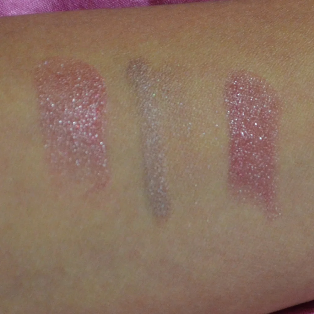
How to create a gradient lip with two shades of lipstick
A gradient lip turns two lipstick shades into a soft ombré, with the richer colour concentrated in the middle and a lighter tone fading towards the edges. The effect looks polished without a sharply drawn outline, and it can suit everything from a quick weekday lip to an evening look that needs a little more depth.
The useful part is that you do not need a special kit of lip products. Two compatible bullets, clean fingers or a small brush, and properly prepped lips are enough. Because the colour is built in layers rather than applied all at once, you can adjust the intensity before it sets—a useful trick in warm, humid weather and in air-conditioned offices where skin can become dry.
| Shade pairing | Finish to expect | Best for | Watch out for |
|---|---|---|---|
| Rose nude and cool berry | Rosy depth with a gentle fade | Workdays and understated evening looks | Keep the rose beige cool so the berry does not create a brownish edge |
| Peach nude and warm coral | Bright but soft, with a warm feel | Casual daytime makeup | Both shades are warm, so use very little coral at the corners |
| Mauve and red-plum | A more saturated, slightly dramatic ombré | Evening looks or bold daytime colour | Match the finishes, as a matte centre and glossy edge can look uneven |
| Brick red and terracotta | Deep, earthy colour with warmth | Autumn and winter wardrobes | Blend the boundary twice because the red will appear stronger |
Choose shades that agree with each other
A gradient works best when the two colours share an undertone, even if their depth is different. A cool rose-beige next to a cool berry will usually blend more cleanly than a yellow-orange next to a blue-red. If you want noticeable contrast, let the lighter shade disappear completely at the edges and keep the deeper shade as a narrow, diffused core rather than trying to merge two unrelated colours.
Gradient placement can also run in either direction. This version keeps the deepest shade in the centre and fades it towards the corners. The reverse—brighter through the middle and deeper around the edges—follows the same preparation and blending rules, but the corner placement needs especially feathery strokes.
For the most forgiving result, choose two satin or two creamy bullets with similar pigmentation. A rich matte centre and a slick nude base can create a halo instead of a gradient, particularly on lips that already shed skin. If you only own one finish, use the lighter shade over the entire lip first, then add the deeper shade sparingly so you can see how much contrast it creates. Australian shoppers can compare options across Sephora, MECCA, Priceline and sites such as Adore Beauty, where prices are in Australian dollars and generally include the 10% GST. That makes it easy to plan two mid-range bullets without chasing imported shades with unfamiliar price tags.
Prep the lips for colour that stays comfortable
Start with clean, dry lips. At the end of a long day, I like to remove makeup with balm cleansers because they dissolve lipstick with less dragging. Then I rinse, pat the lips dry and wait a few minutes; moisture sitting under lipstick can make the first layer slide.
Exfoliation helps only when it is gentle. A soft, damp cloth or a fragrance-free lip scrub used once or twice a week is enough, while harsh scrubbing can leave tiny flakes that catch the colour. If your lips flake on a particular day, skip the scrub and simply smooth away loose skin with a clean tissue.
Follow with a plain moisturising balm, then blot rather than rub. Let the balm settle for a few minutes before applying colour. Primer is optional, and it is most useful when you want a matte bullet to last longer or when the deeper shade is highly pigmented. Too much primer can create a dry, patchy surface, so use a thin layer and focus it where the two colours will meet.
Lay down the lighter shade as a soft base
Take the lighter of your two shades and apply a thin veil over the whole lip, reaching just short of the natural edge. Using the bullet directly gives more control than a broad swipe, while a small flat brush can distribute a creamy formula more evenly. The aim is an even background, not complete opacity.
Do not draw a dark outline at this stage. An outline tells the eye where the lip ends and works against the blurred finish. If the lighter colour reaches the edge, keep it sheer; a fully covered rim can make the gradient look like a patch sitting on the skin. A cotton bud dipped in foundation can soften one stubborn edge, but use it lightly so you do not create a pale halo.
Keep your mouth relaxed as you work. Pressing the lips together after every stroke often creates an abrupt division through the middle. Instead, touch the upper and lower lips together once, then check the balance in a mirror. If one side has more colour, redistribute it before moving on. This is much easier while the base is still thin and slightly tacky.
Add the deeper shade and blend before it sets
Now place the deeper shade in the centre of the upper and lower lips. Think of a soft column rather than a stripe covering the full width. Use short, light strokes, keeping the strongest colour away from the corners. The centre will look intense for a moment, but the edges of that patch should remain soft.
Blend outward with a clean fingertip, a small brush or a damp sponge. A finger is excellent for cream bullets because warmth helps the pigment spread, while a brush gives more control over a satin formula. Tap rather than drag, and lift away any excess colour on your fingertip before returning to the lip. Work one half at a time so you can judge the fade without losing symmetry.
For an evenly diffused edge, I prefer a product that disappears into the skin. My switch from powder to a cream stick contour came down to the same preference: a cream texture can be softened with a touch more pressure, while powder tends to sit in a distinct edge. That lesson applies to lipstick too. Blending the deeper shade into a thinner veil at the border takes patience, but it prevents the two colours from looking separated.
A good test is to pull slightly away from the mirror and look at the lips as a whole. You should see a deeper centre with no obvious line where the lighter shade begins. If the transition is too sharp, use a clean fingertip to press the boundary gently. If the whole lip has become too intense, blot the centre with a tissue, then lightly reapply the lighter shade around the edges.
Check the wear through an Australian day
Gradients tend to wear at the centre first, where the lips rub against each other, while the edges keep their colour. Translucent blotting paper pressed over the lips after five or ten minutes can remove oil without flattening the ombré. A tissue works too, although it can take more pigment with it. Keep the original bullet nearby for a small touch-up rather than rebuilding both shades.
Skip the mistake of applying a thick layer of ordinary balm over finished colour. It will soften the lipstick and blur any clean fade you created. If your lips start to feel tight, stop adding colour rather than trying to fix dryness over the finished look. For outdoor wear in Australia, an SPF 50+ lip balm is a practical companion for strong sun exposure; apply it before colour and reapply as directed, since sun protection does not replace the two shades of lipstick.
Humidity and air-conditioning pull in opposite directions. On a humid Gold Coast afternoon, a cream formula may feel rich, so blot and keep the layers light. In a dry Melbourne office, a satin bullet may be more comfortable. This is where a gradient shines: a soft edge makes reapplication less noticeable. If a colour pairing looks a beaut but one bullet starts to feel overdone, reduce the deeper shade rather than adding a third colour.
Make the two-shade lip your next everyday look
The easiest way to begin is with the two colours already in your makeup bag. Try the lighter shade on the entire lip, add the deeper shade only through the centre, then blend before you add anything else. Give the look ten minutes to settle, photograph it in daylight and check how it wears after a coffee or lunch. That simple test will show whether the shades have enough contrast and whether the deeper bullet is too strong for your lips.
A gradient should look like colour that grew softer at the edges, not two separate lipsticks fighting for attention. Pick a pairing, give it a short wear test this week and keep the one that feels wearable. A slightly deeper version suits dinner, while a softer blend works for daytime. Two well-chosen shades and a light touch are all it takes.
Brands featured on bronzer bunny
Luxury & Mid-Range Favorites
Joyce covered an extensive range of beauty brands, from prestige houses to accessible drugstore staples.

Recurring Series
Love It or Toss It • Products That Didn't Work for Me • Weekly Rotation • Saturday Recap • Lipstick Diaries • Makeup Challenge!
JOYCE'S SIGNATURE SERIES KEPT READERS HOOKED
Read the Series