
Luxury Beauty Blog
bunny
Honest makeup reviews, product comparisons, FOTD looks, and beauty hauls — from a beauty-obsessed friend who tells it like it is.
Explore the Blog
"I am a major beauty addict, but my biggest challenge is actually using the products I'm obsessing over! I shop frequently, but most days pass and not a speck of makeup goes on my face."
— Joyce, bronzer bunny
Meet Joyce
About bronzer bunny
A beauty journey, one swipe at a time
Joyce started bronzer bunny to share her honest take on luxury and mid-range beauty products. Based near Chicago, she's a self-described beauty addict who loves connecting with fellow enthusiasts. Her blog features in-depth reviews of brands like Chantecaille, Burberry, Tom Ford, Nars, Guerlain, and Tatcha — always with a warm, conversational voice.
Recurring series like Love It or Toss It, Products That Didn't Work for Me, Weekly Rotation, and Lipstick Diaries kept readers coming back for real talk about what's worth the splurge. From FOTD posts to shopping hauls along Chicago's Magnificent Mile, Joyce documented her makeup journey from November 2011 through early 2014.

Finding a Bronzer That Looks Like Summer on Your Skin
The right bronzer should bring warmth and dimension to your face without announcing where the product begins and ends. When the shade is well matched, cheeks look softly sun-kissed, the complexion appears more alive, and even a quick makeup routine feels polished. When the color is wrong, the result can lean orange, gray, muddy, or strangely disconnected from the neck.
Choosing a bronzer involves more than matching a shade to how fair or deep your skin appears. Undertone, finish, formula, season, and placement all affect the final result. A powder bronzer may look perfect in winter but too pale after a summer tan, while a creamy formula can blend beautifully over bare skin and disappear under a heavier base.
Beauty counters often divide products into categories such as fair, light, medium, tan, and deep, but those labels are only a starting point. Real-world testing in daylight, over your usual foundation, and after several hours of wear gives a more useful answer than a swatch alone.
Start With Your Skin Depth
Skin depth describes how light or deep your complexion appears overall. Very fair skin usually suits the palest bronzers, while medium, tan, and deep skin tones need progressively richer pigment to create visible warmth. The goal is generally one to two shades deeper than your natural skin, rather than choosing the darkest color available.
Fair complexions can be overwhelmed by highly saturated terracotta or red-brown shades. Look for beige, soft caramel, neutral tan, or muted honey tones, depending on your undertone. A sheer formula is often easier to control than a strongly pigmented powder because it allows you to build color gradually across the forehead, cheekbones, and jawline.
Light to medium skin has a wide range of options, including golden tan, neutral caramel, soft bronze, and muted terracotta. Medium complexions can often handle more pigment, but intensity still matters. A bronzer that appears delicate in the pan may become quite strong when layered over foundation, cream blush, or luminous sunscreen.
Tan and deep skin tones need enough depth and saturation to remain visible without creating a chalky cast. Rich cinnamon, copper, red-brown, deep caramel, and neutral espresso shades can work well. Extremely pale bronzers may look ashy because they do not provide enough warmth or contrast, especially when applied over a full-coverage base.
Identify Your Undertone
Undertone is the subtle color beneath the surface of your skin. Warm undertones tend to look golden, yellow, peach, or olive; cool undertones may lean pink, rosy, or bluish; neutral undertones sit between the two. Olive skin can be especially difficult because it may look warm in some lighting while reacting poorly to orange-based bronzers.
A warm undertone usually pairs well with golden tan, honey, caramel, and terracotta bronzer shades. These colors echo the natural warmth in the complexion rather than fighting it. If a golden bronzer makes your skin look unusually orange, select a more neutral brown with less yellow or red saturation.
Cool undertones often look balanced with neutral beige-brown, rosy bronze, or soft taupe shades. A very orange bronzer can appear artificial, particularly when it is concentrated around the temples. That does not mean cool skin must avoid warmth altogether; a muted bronze with a restrained red or golden base can still create a believable sun-kissed effect.
Neutral and olive undertones may have the most flexibility, but they can also expose mismatched shades quickly. Neutral skin often works with both warm and cool bronzers when the depth is appropriate. Olive skin may prefer neutral brown, muted golden, or slightly green-leaning bronze tones rather than bright orange. Look at your face, neck, and chest together before deciding, since visible contrast between these areas can reveal an undertone mismatch.
Choose Between Warmth and Definition
Bronzer and contour are related but serve different purposes. Bronzer adds warmth, while contour creates the appearance of shadow and structure. A traditional contour shade is usually cooler, more muted, and less golden than a complexion-warming bronzer. Using a gray contour shade across the entire face can make the complexion look dull, while using an orange bronzer beneath the cheekbones may look like misplaced blush.
For an everyday bronzed look, choose a shade that resembles the color your skin naturally develops after gentle sun exposure. This is often warmer than your contour but more subdued than a bright orange blush. Apply it where sunlight would naturally reach: the upper forehead, tops of the cheeks, bridge of the nose, and a small amount across the chin.
If you prefer sculpted makeup, keep the bronzer and contour distinct. Sweep bronzer slightly higher and farther outward, then use contour only where you want visual recession. This separation is especially helpful with cream products, which can become muddy when several brown shades are blended over the same small area.
Finish also changes the impression of color. Matte bronzer tends to look more natural and softly defined, especially when pores or texture are visible. Satin and softly luminous formulas can make dry skin look healthier, but visible shimmer may emphasize texture or compete with highlighter. Fine pearl is usually more forgiving than chunky glitter when the product is intended for the whole face.
| Skin depth and undertone | Useful bronzer families | Shades to approach carefully | Finish and formula notes |
|---|---|---|---|
| Very fair, cool or neutral | Beige-brown, soft taupe, muted rose bronze | Bright orange, deep red-brown | Sheer powder or softly blending cream |
| Fair to light, warm | Honey, light caramel, golden tan | Strong red or highly saturated terracotta | Satin or buildable matte |
| Light to medium, neutral | Neutral tan, soft bronze, caramel brown | Very yellow gold or gray taupe | Powder, cream, or liquid with moderate pigment |
| Medium, warm or olive | Golden caramel, muted terracotta, bronze brown | Neon orange, pale beige | Satin, matte, or cream-to-powder |
| Tan, neutral or cool | Rosy bronze, cinnamon brown, neutral copper | Ashy beige, extremely yellow gold | Pigmented but blendable formulas |
| Deep, warm or neutral | Rich copper, red-brown, deep caramel, espresso bronze | Pale tan, chalky beige, gray contour shades | Cream, balm, or richly pigmented powder |
Test Color in Real Lighting
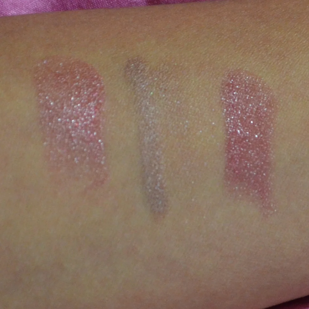
Swatching on the hand is convenient, but the hand may be a different depth and undertone from the face. Test bronzer along the cheek, jawline, or upper neck instead. A small stripe near the ear is useful because it shows whether the color connects naturally with both the face and the neck.
Check the shade in indirect daylight whenever possible. Store lighting can make bronzers look more neutral or more flattering than they really are, and warm indoor bulbs often disguise orange tones. A product that appears slightly too subtle in daylight may become ideal after foundation, blush, and setting powder are added.
Allow cream and liquid products a few minutes to settle. Some formulas deepen as they dry, while others lose their initial glow and become more matte. Powder bronzers can also look different after oils from skincare and foundation mix with the pigment. A short wear test shows whether the color remains attractive or becomes darker and less even.
Photography provides another useful check. Take a quick image with and without flash, but do not rely on the camera alone. Flash can exaggerate shimmer and make a good bronzer appear pale, while phone processing may alter warmth. The most dependable decision comes from comparing the product in daylight, indoor light, and your normal makeup conditions.
Match the Formula to Your Routine
Powder bronzer is the easiest option for beginners and for anyone who prefers adjustable coverage. It works particularly well over foundation and setting powder, and a fluffy brush can diffuse excess pigment quickly. Pressed powders are convenient for travel, while loose formulas can offer a softer veil but require more care around packaging and application.
Cream bronzer blends naturally into bare skin, tinted moisturizer, and lightweight foundation. It is often a strong choice for dry or mature skin because it does not always emphasize surface flaking. Use a small amount first, warm it between the fingers or on the back of the hand, and press it into the complexion rather than dragging it across the base.
Liquid and balm bronzers can provide a fresh, skin-like finish, but their intensity varies widely. Some are sheer enough for a quick wash of color; others contain concentrated pigment and require a damp sponge or dense brush. If you enjoy changing coverage, choose a buildable formula instead of one that reaches full intensity with a single dot.
Your preferred makeup style matters as much as your skin type. Someone who wears a full-coverage matte base may prefer a powder bronzer that layers cleanly, while a minimal makeup routine may look more seamless with a cream or liquid. In personal testing, the best product is rarely the one with the most luxurious packaging; it is the one that blends without disturbing the products underneath.
Adjust for Seasons and Application
A bronzer shade that suits you in January may look too pale after several weeks outdoors in July. Rather than replacing your entire collection, consider keeping a lighter and deeper option or mixing a cream bronzer with a sheer base product. A deeper shade can also be used sparingly around the perimeter of the face while the lighter one is placed on the cheeks.
Apply less product than you think you need, then assess the balance from a distance. Start at the hairline and outer cheek, where warmth naturally looks believable, and use whatever remains on the brush across the nose and chin. Concentrating the product in the center of the face can make the complexion look heavily painted.
Brush shape affects shade intensity. A large, loose brush creates a diffused veil, while a smaller dense brush deposits more pigment and can make a previously subtle bronzer appear dramatically deeper. For cream formulas, a stippling brush or damp sponge often gives a softer edge than a firm buffing brush.
When the color feels slightly off, do not immediately discard it. A too-warm shade may work as a body bronzer or blend well beneath a neutral powder. A too-pale shade can add gentle dimension to fair skin, while a too-deep product may become wearable when mixed with moisturizer or applied with a clean, fluffy brush. Still, a persistent orange or gray cast usually indicates a true shade mismatch rather than an application problem.
Build a More Reliable Shopping Routine
A thoughtful purchase begins with observing how your complexion behaves throughout the day. If foundation oxidizes, test bronzer over the foundation you actually wear rather than over bare skin. If you prefer sunscreen-only days, compare the same product on both bare and made-up skin. Texture, oil production, and skincare can change the way pigment settles.
Pay attention to longevity as well as the first five minutes of wear. A flattering bronzer that disappears by lunchtime may be less useful than a slightly less exciting shade that stays even through errands and meals. My approach to wear testing is similar to the detailed tracking in this 12-hour lipstick test: check the product at several points instead of judging it immediately after application.
Finish can be adjusted with the rest of your makeup. A matte bronzer looks softer over luminous skin, while a radiant bronzer may need a matte base to prevent excessive shine. If dry patches are a concern, moisturize and allow skincare to settle before testing; otherwise, the product may cling in places and give an inaccurate impression of its texture.
Before buying a luxury bronzer, compare its shade range, pan size, blendability, and wear against less expensive alternatives. Price can reflect packaging, fragrance, and milling, but it does not guarantee a better color match. Reviews that describe undertone, pigmentation, brush behavior, and fading are more useful than broad claims that a product is simply “beautiful.”
Practical checks before purchasing
- Compare the bronzer with your neck and chest, not just the back of your hand.
- Test warm, neutral, and cool versions at the same depth whenever possible.
- Leave the swatch on for several hours to check oxidation and fading.
- Consider whether the finish suits your foundation, sunscreen, and skincare routine.
- Choose a buildable formula if you are between shades or change depth seasonally.
Create a Natural Face With the Right Balance
Bronzer rarely works in isolation. Blush, highlighter, foundation, and lipstick influence how warm the complexion appears. A coral blush can make a neutral bronzer seem more golden, while a cool pink blush may make an orange bronzer stand out. Keeping the undertones coordinated creates a more intentional finish.
The rest of your makeup can also guide the depth you choose. A soft, monochromatic look may need only a sheer bronze veil, while dramatic eye makeup can support stronger definition around the perimeter of the face. When wearing a bold eye look, I often keep the bronzer controlled so the overall result stays balanced; this same principle appears in my reflections on a same eyeshadow look worn repeatedly.
Lip color affects the perceived warmth of the entire face. A blue-based lipstick can make orange bronzer look more noticeable, while a warm nude or terracotta lip may make it appear more harmonious. If your bronzer seems too dry or disconnected from the rest of the look, a hydrating lip finish and softly luminous skin can restore balance; these matte lipstick tips offer a useful parallel for adjusting finish without adding unnecessary shine.
The most convincing bronzer is the one that supports your features rather than covering them. Select the closest depth, refine the undertone, test the formula in real conditions, and apply it where natural warmth would appear. Add your chosen shade to your everyday routine, wear it through a full day, and let its performance—not the packaging or the first swatch—decide whether it earns a permanent place in your makeup bag.
Brands featured on bronzer bunny
Luxury & Mid-Range Favorites
Joyce covered an extensive range of beauty brands, from prestige houses to accessible drugstore staples.

Recurring Series
Love It or Toss It • Products That Didn't Work for Me • Weekly Rotation • Saturday Recap • Lipstick Diaries • Makeup Challenge!
JOYCE'S SIGNATURE SERIES KEPT READERS HOOKED
Read the Series